


TL;DR
A logo works when it is easy to recognise, easy to remember, and fits the brand’s stage and context.
- Wordmarks are best for new brands to build name recognition
- Symbols and abstract logos need time and repetition to gain meaning
- Combination logos offer flexibility as brands grow
The most effective logos are clear at small sizes, work across platforms, and stay consistent over time. Instead of focusing solely on aesthetics, brands should choose a logo type based on usability, scalability, and long-term recognition.
Logos are often judged on how they look. In practice, what matters more is how easily they are understood and remembered.
Brand identity crises rarely stem from poor aesthetics or how badly the logo is designed. More often, the friction arises from a fundamental disconnect: the logo no longer reflects the brand's current maturity or its evolving strategic goals.
For example, early-stage companies sometimes choose symbol-led logos that require prior familiarity to make sense. On the other hand, businesses with complex offerings may reduce themselves to initials that don't carry enough meaning on their own.
A logo's main job is simple: it helps people spot your brand fast and remember it later. Different types of logos tackle this in their own ways, so picking the right logo is less about personal taste and more about what actually fits your situation.
1. Pictorial Logos (Brand Marks)
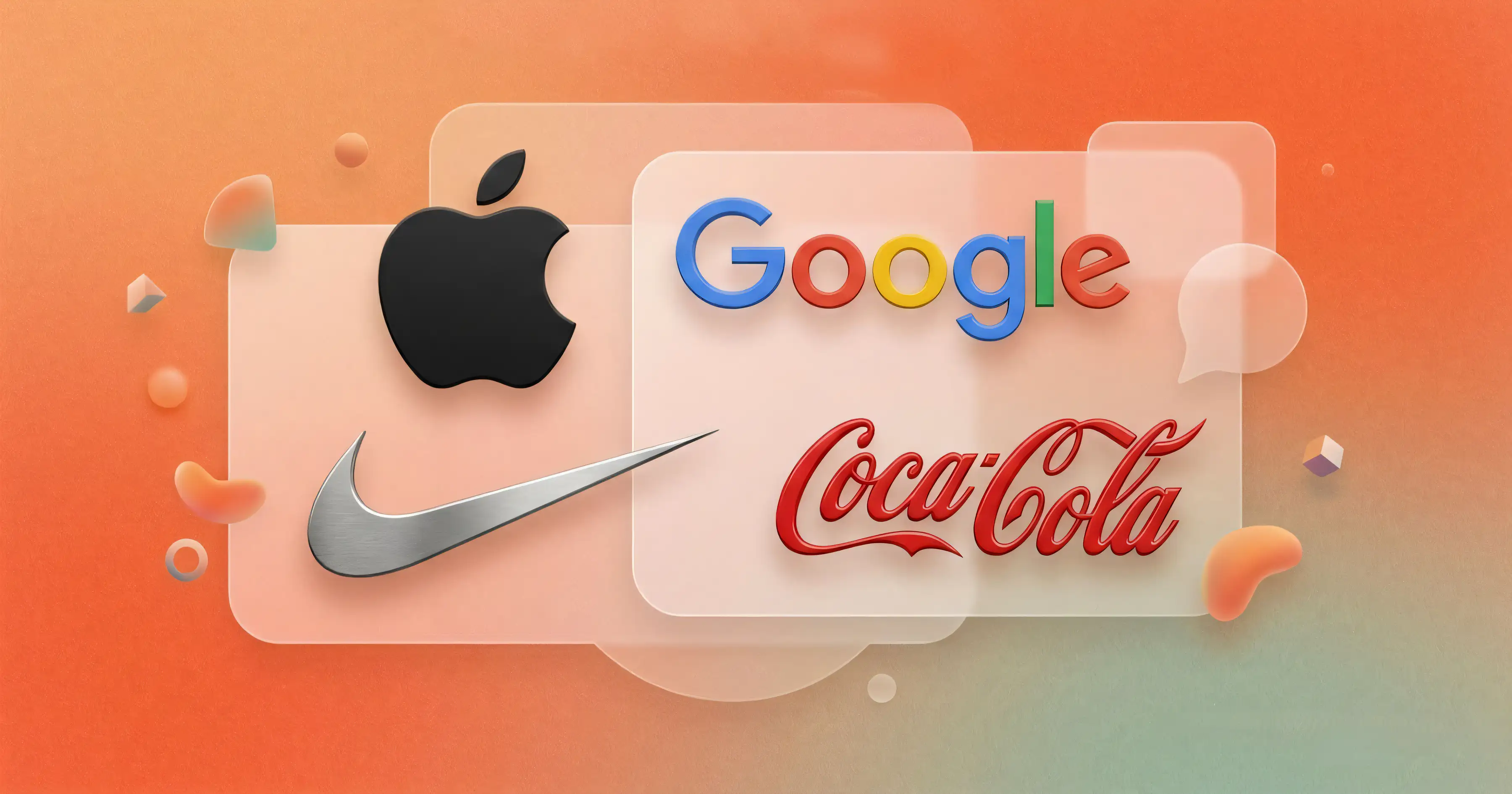
A pictorial logo is an icon or symbol used without text, like Apple, Nike, Shell, World Wildlife Fund or Twitter (now known as X).
These logos work because the symbol has been repeated enough times to carry meaning on its own. That association is built over years of consistent use across products, marketing, and culture.
For newer brands, this is usually not the most practical starting point. Without existing recall, the symbol needs constant support from the brand name to be understood and remembered.
Where it works best
- Brands with strong awareness
- Products used frequently
- Global audiences where language becomes a barrier
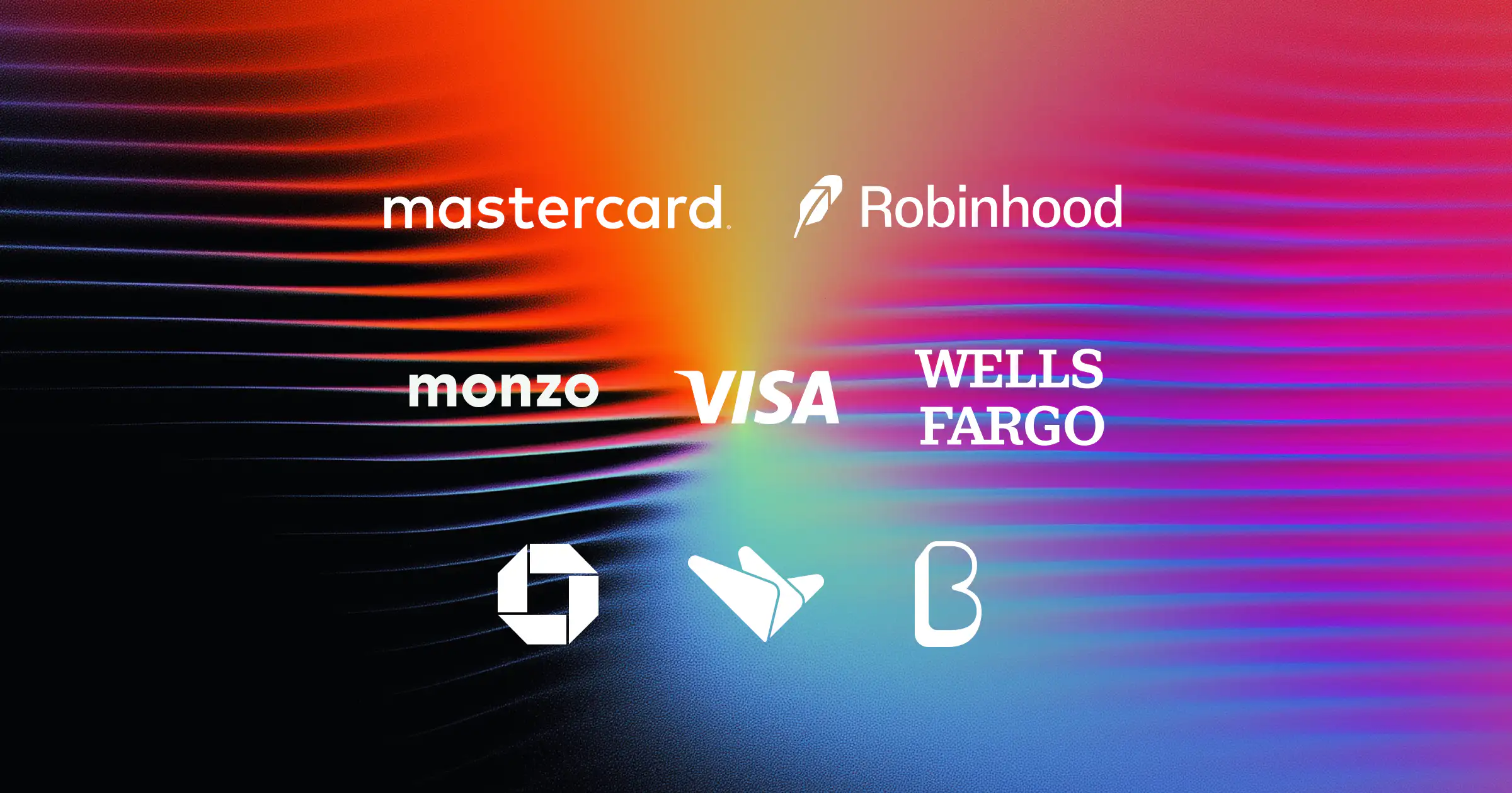
2. Lettermark Logos (Monograms)
They are typically used when the full name is long or difficult to use across formats. The trade-off is that meaning is reduced, especially for people encountering the brand for the first time.
Because of this, lettermarks rely heavily on repetition and context to build recognition.
Where it works best
- Long or multi-word brand names
- Brands with high visibility (media, enterprise, institutions)
- Use cases where space is limited
3. Wordmark Logos (Logotypes)
This is often the most effective choice for early-stage brands because it directly builds name recognition. There is no decoding required, and the audience immediately knows what to remember.
The design challenge here lies in typography rather than symbolism. Small decisions around spacing, weight, and form do most of the work.
Where it works best
- New brands are trying to build recall
- Brands with distinctive or short names
- Categories where clarity matters more than abstraction
4. Combination Logos
Combination logos combine a symbol and a wordmark, for example, MicroSave Consulting, Adidas, Lacoste, and Dropbox.
This is one of the most practical approaches because it allows flexibility. The brand can use both elements together or separate them over time as recognition improves.
Many brands eventually move toward using just the symbol, but that transition typically happens after years of consistent exposure.
Where it works best
- Brands building recognition over time
- Companies that need flexibility across platforms
- Teams that want both clarity and distinctiveness
5. Emblem Logos
Emblems place text inside a contained shape, often resembling badges or seals used by companies such as Starbucks, BMW, Pepsi, Warner Bros. and Harley-Davidson.
They tend to communicate heritage, authority, or craftsmanship. Because of their structure, they can feel more formal and less flexible in digital contexts.
Scaling can also be a challenge, especially on smaller screens.
Where it works best
- Legacy brands
- Institutions, education, and automotive
- Brands where trust and tradition are central
6. Abstract Logos
Abstract logos use shapes that don't directly represent real-world objects like BP, Reebok, MasterCard, PlayStation and Claude.
These logos are designed to carry meaning over time rather than communicate something literal from the start. This gives brands more freedom, but also requires consistency to build an association.
They are often supported by strong brand systems—colour, motion, typography—to reinforce recognition.
Where it works best
- Brands that want to own a unique visual space
- Companies operating across multiple categories
- Brands investing in long-term identity systems
7. Mascot Logos
They tend to feel more approachable and are particularly effective in categories where personality plays a role, especially in industries like food, entertainment, or family-oriented products.
The challenge is maintaining consistency and avoiding over-complication as the brand evolves.
Where it works best
- Consumer brands with broad audiences
- Categories where warmth and familiarity matter
- Brands that rely on storytelling or campaigns
8. Composite Logos
Composite logos combine multiple logo characteristics into a single mark, making them difficult to classify into a single category such as NASA, Airbnb, McDonald's and Snapchat.
A composite logo might include a symbol that feels abstract, while also functioning like a pictorial mark, or a wordmark that is stylised enough to behave like a graphic element. These logos blur boundaries rather than fitting neatly into one type.
They are not built as separate elements like combination logos. Instead, the elements are integrated into one unified form.
This makes them more expressive, but also harder to define and replicate. Their strength lies in how seamlessly different characteristics come together into a single recognisable unit.
Where it works best
- Brands that don’t fit neatly into one category
- Identities that rely on a distinctive, ownable form
- Companies looking to create something less conventional and more fluid
What Actually Makes a Logo Work
In most cases, a logo starts working when it becomes easy to recognise without relying on context.
It doesn't have to be minimal or overly simple, but the viewer should not have to spend time interpreting it. The shape, the name, or the combination should register quickly enough that the brain can move on.
And this is where many logos fall short. Sometimes logos are designed to be interesting when examined closely, but most people never examine logos closely. They encounter them in passing on a screen, on packaging or in a crowded environment. If recognition doesn't happen in that moment, the logo hasn't done its job yet.
Another factor is how the logo builds familiarity over time. Some logos are designed to be immediately clear, especially wordmarks. Others, like abstract or pictorial marks, require repeated exposure before they feel familiar. Neither approach is wrong, but they require different levels of patience and consistency from the brand.
It's also worth noting that a logo never works in isolation. It is part of a larger system that includes colour, typography, layout, and motion. When a logo struggles, the issue is often more than the mark itself, but how it fits (or doesn't fit) into that system.
A good logo reduces the effort required to recognise a brand. A weak one increases that effort slightly every time it appears. Over time, that difference compounds.
How to Stress Test a Logo?
Most teams review logos in ideal conditions. Logos, while testing, are often large, centred, and distraction-free. That's rarely how people experience them.
In reality, logos are seen:
- briefly
- at small sizes
- alongside other competing visuals
- often without any supporting explanation
Looking at your logo in those conditions tends to reveal more than a polished presentation ever will.
For example, it helps to check:
- how it behaves as an app icon or favicon
- whether it still holds its structure when reduced
- how it looks when placed next to competitors
- whether it still feels connected to the category without supporting text
Another useful test is distance. If you step away from the screen or glance at it quickly, does it still register as something identifiable, or does it blur into a generic shape?
These are small checks, but they reflect real usage. Most logo issues surface here, and when they do, they are usually tied to clarity, structure, or over-complication and not just aesthetics.
A Simple Framework to Evaluate a Logo
Instead of a checklist, it's more useful to think of a logo across a few dimensions. Each one answers a slightly different question about how the logo will perform in the real world.
1. Speed (How quickly does it register?)
Can someone look at it for a second and understand what they're seeing? This doesn't mean it has to fully explain the business, but it shouldn't be confusing or require interpretation.
2. Recall (Does it stay with you?)
After seeing it once or twice, does anything about it stick? This could be the name, a shape, or a distinctive visual pattern.
3. Clarity (Is anything getting in the way?)
Does the design feel clean enough to process easily, or is there unnecessary detail that makes it harder to read or recognise?
4. Range (Where can it go?)
Can it work across different sizes and formats, such as app icons, packaging, social media, and print, without losing its structure or legibility?
5. Longevity (Will it hold up over time?)
Is it built on something stable, or is it tied too closely to a visual trend that may not age well?
6. Distinction (Does it stand apart in context?)
When placed next to competitors, does it feel identifiable, or could it be mistaken for something else in the same category?
7. Fit (Does it match the brand itself?)
Does it align with who you're trying to reach and how you want to be perceived? A logo can work perfectly on its own and still feel off for the brand.
Note: No logo will score perfectly across all of these, and that's fine. The goal is not perfection, but balance. The trade-offs you make should be intentional.
Why Most Brands End Up Mixing Logo Types
In practice, most brands move toward a combination of elements, even if they don't initially plan for it.
A wordmark is useful when clarity is important, especially in the early stages. A symbol becomes useful later, when recognition improves, and space becomes limited. Sometimes a secondary element, like a mascot or graphic device, appears in campaigns or marketing.
This approach solves different problems in different contexts.
For example:
- On a website header, the full name might work best
- On an app icon, only a symbol fits
- On social media, a simplified version may be more effective
Trying to force a single logo to work everywhere often leads to compromises. Either it becomes too detailed to scale down, or too minimal to communicate clearly.
Brands that handle this well usually think in terms of a system rather than a single mark. The core elements stay consistent, but how they are used can adapt.
Over time, as familiarity builds, the system can simplify. But that simplification is earned, not assumed.
Choosing the Right Direction While Creating a Brand Logo
Choosing a logo type becomes clearer when you anchor it in the realities of the business rather than in design preferences.
If the brand is new, the priority is usually recognition. In that case, keeping the name visible and easy to read tends to work better than relying on symbols that take time to understand.
If the name itself is long, complex, or not very distinctive, then simplifying its appearance becomes important. This could mean tightening the wordmark, introducing a shorter version, or pairing it with a visual element that carries some of the load.
Category also plays a role. In some industries, such as finance, healthcare, education and food, there are strong visual patterns. Trying to completely break away from them can sometimes create confusion instead of distinction. In those cases, the goal is to stay recognisable within the category while still being identifiable.
Usage is another practical constraint that often gets overlooked. A logo that looks good on a presentation slide may not hold up on a mobile screen, a product label, or a small digital placement. Thinking about where the logo will actually live helps avoid redesigns later.
Finally, it helps to think a few steps ahead. If the brand is expected to grow, expand into new categories, or build a broader identity system, the logo should be flexible enough to support that. Overly rigid or overly literal approaches can become limiting over time.
How We Think About Logos at Sparklin
At Sparklin, we approach logos as a part of a larger system that shapes how a brand is recognised, understood, and remembered over time. Because of that, most of our work starts with understanding what the brand needs to do at its current stage.
For some brands, the priority is clarity, being easy to recognise and remember. For others, it may be about standing apart in a crowded category or building something that can scale across multiple products and contexts. These are slightly different problems, and they don't lead to the same kind of logo.
Underlying all of this is a simple belief: the brands people trust over time tend to behave less like companies and more like people. They are consistent and predictable in a reassuring way, and they feel familiar across interactions. That familiarity is not built through design alone, but through how the brand shows up repeatedly across products, communications, and experiences.
The logo plays a role in that system, but it is only one part. It becomes effective when it aligns with that broader behaviour and when the way the brand looks, speaks, and acts feels coherent.
The brands that stay with people are usually the ones that feel familiar in how they behave, and the logo is one small but important part of that consistency.