
On October 15, 2025, the media world shook.
MTV, the channel that defined music television for generations, announced it would be shutting down five of its iconic music channels: MTV Music, MTV 80s, MTV 90s, Club MTV, and MTV Live by the end of 2025. Started over 40 years, it changed the way people discovered music, turning unknown artists into global stars overnight. At its peak, the channel reached over 1 billion households across more than 180 countries, with regional versions in Europe and Asia.
MTV introduced generations to iconic shows such as , , , and , blending music with youth culture, fashion, and social trends. It also launched legendary events including the MTV Video Music Awards and MTV Europe Music Awards, cementing its position as a cultural powerhouse.
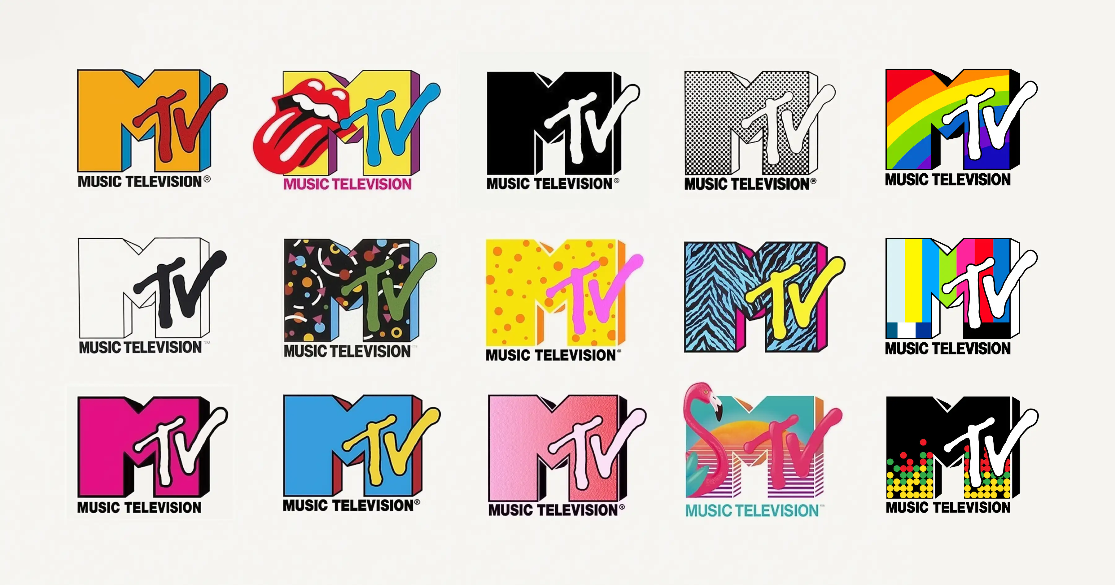
The logo has always been a central part of that influence. The bold block with the graffiti-style appeared everywhere: screens, posters, merchandise, and music videos. Its colors, textures, and patterns evolved constantly while the shape remained instantly recognizable.
The design captured the spirit of every decade: the neon energy of the 1980s, the grunge textures of the 1990s, the digital polish of the 2000s, and the minimalist aesthetic of the 2010s. The MTV logo reflected the energy, rebellion, and creativity of each generation.
MTV may be turning off its broadcast, but the logo will continue to carry its legacy in global culture.
1977–1981
Before MTV officially launched, Warner Cable tested the idea of music on television with in 1977. The program experimented with how music could be presented visually and how audiences responded to a dedicated music channel. The early logo for was simple and functional, reflecting its experimental nature. It lacked the boldness, flexibility, and personality that MTV would later become famous for, but it established the first visual identity for a channel that was about to transform how people experienced music on screen.
1980 A failed logo
By 1980, as the channel prepared to launch as MTV, Manhattan Design created the first logo featuring the MTV name. This early attempt was functional but fell short of capturing the energy and rebellious spirit that would define the network. Even Fred Seibert, MTV’s founding president, admitted, “It was awful.”
While the design lacked boldness and flexibility, it served as an important experiment. It established the concept of a visual identity for MTV and set the stage for the breakthrough logo that would arrive in 1981; a design that combined a blocky , a graffiti-inspired , and the playful adaptability that allowed the logo to evolve with youth culture.
1981-1994 The Original Static + Flexible Hybrid
The breakthrough came in 1981 with a logo that truly captured MTV’s spirit. Designed by Pat Gorman, Frank Olinsky, and Patti Rogoff of Manhattan Design, it paired a bold, blocky with a hand-drawn, graffiti-style . The combination created a striking contrast between structure and rebellion, reflecting the energy and creativity of youth culture at the time.
What made this logo revolutionary was its flexibility. It was designed never to look the same twice. Colors, textures, and patterns inside the could change for each broadcast, making the logo a living reflection of the decade’s music, fashion, and visual trends. Paired with the tagline , this version established MTV’s identity as both instantly recognizable and endlessly adaptable, setting a standard for experimental design in media.
1994-2010: Identity-as-Canvas
By the mid-1990s, MTV fully embraced its logo as a playground for experimentation. Designers pushed the boundaries with thousands of variations such as melting letters, grunge textures, pop-art treatments, and 3D animations. The logo became more than a static mark; it was a living canvas reflecting the mood, trends, and rebellious spirit of the decade.
This era coincided with the rise of motion graphics and digital animation in television. MTV’s playful approach influenced designers and animators worldwide, showing that a logo could be flexible, dynamic, and culturally relevant. Whether distorted, animated, or textured, the remained instantly recognizable, proving that a strong core identity could evolve without losing its impact.
2010-2021 Rebrand: Minimal and Flat
In 2010, MTV dropped the tagline to reflect a broader focus on reality TV and general entertainment. The logo was simplified, often cropped, and presented in a more static form compared to its earlier, ever-changing iterations.
Despite the simplification, the brand maintained flexibility. Color and texture variations appeared for special events, award shows, or digital campaigns, ensuring the logo stayed visually engaging. This period emphasized clarity, digital adaptability, and clean design while honoring the playful, experimental roots that had defined MTV for decades. Even as programming shifted, the logo continued to anchor the channel’s identity and connect with audiences worldwide.
2021-Present: Social Media & Event-Specific Logos
In recent years, MTV has leaned into social media, global events, and regional editions to keep the logo relevant in a digital-first world. Neon, holographic, and 3D variations now appear online and on screen, while the core structure remains instantly recognizable.
These modern adaptations show how the logo continues to balance consistency with creativity. It can be playful, experimental, or trend-forward depending on the campaign, yet it always signals the brand at a glance. Even as MTV navigates a fragmented media landscape, the logo remains a cultural anchor, connecting decades of youth, music, and pop culture under a single, enduring mark.
MTV’s Logo as a Cultural Lens
MTV’s logo has always been more than a mark; it has been a lens through which we can read decades of youth culture. Its enduring “M + TV” structure provided a stable anchor, while its ever-changing fills and textures allowed designers to respond to shifts in music, fashion, and visual culture. From graffiti rebellion to grunge distortion, digital polish to minimalist flatness, the logo has constantly adapted without losing its identity.
The true genius lies in its flexibility. Where most brands fear inconsistency, MTV embraced it, turning the logo into a platform for creativity. It invited collaboration with designers, animators, and artists, reflecting the experimental spirit of the generations it served.
Even in an era of social media campaigns, neon renderings, and holographic effects, the logo continues to resonate because it balances continuity with reinvention. As MTV shutters its broadcast era, the logo stands as a testament to a rare design philosophy: a mark can be both instantly recognizable and endlessly playful, capturing the spirit of youth across decades.