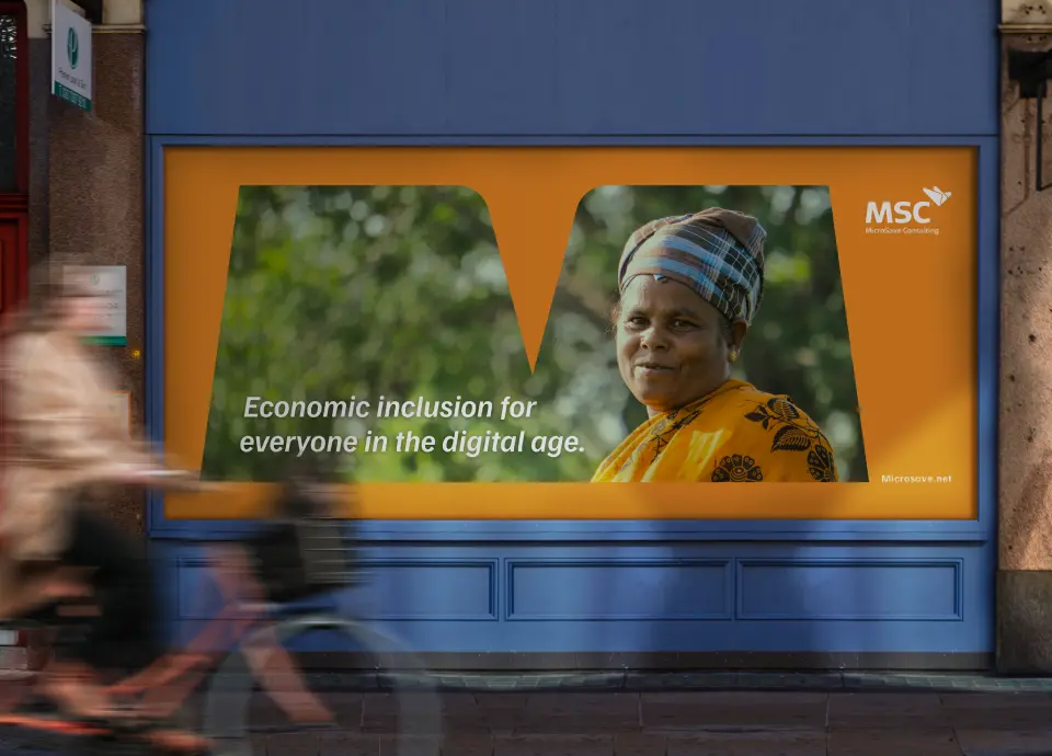
Redesigning the MyUpchar
Healthcare Platform:
UX Strategy & Product Design
Case Study


How can a digital healthcare platform redesign its product UX
to support millions of patients and doctors?
With Sparklin, MyUpchar rebuilt its healthcare app experience
with a scalable UX architecture, streamlined doctor workflows,
and a patient-first product design built for Bharat users.
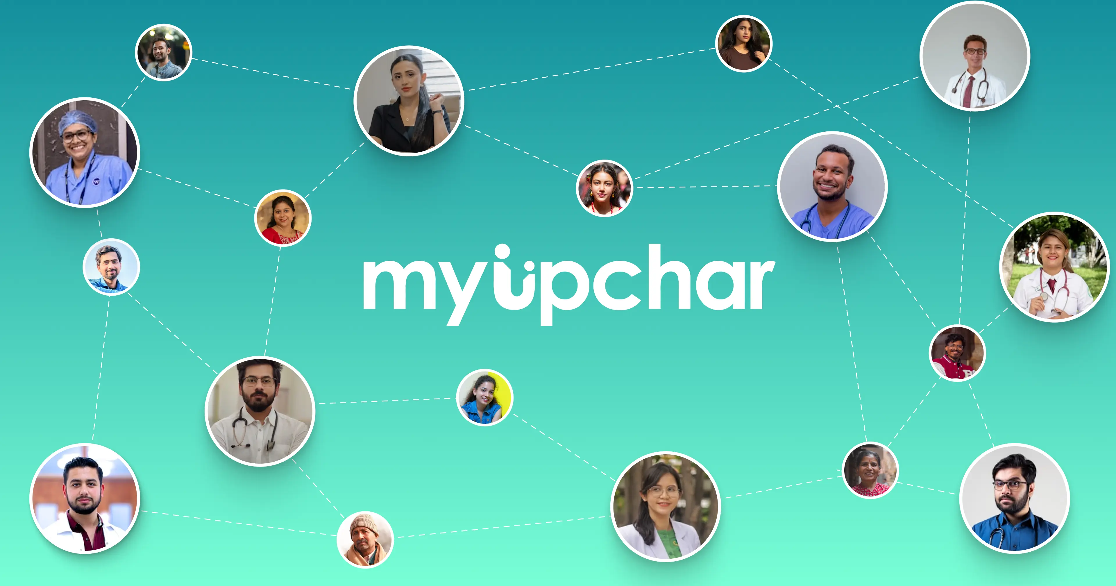
10,000+
doctors on
MyUpchar platform
2Bn+
lifetime health
 information views
MyUpchar’s mission, at the time of their launch, was straightforward but ambitious: to make reliable healthcare information accessible to millions of Indians in their own language.
At the time, most digital healthcare platforms in India were built with urban, English-speaking audiences in mind. For large parts of the country, especially across North and Central India, finding trustworthy medical information online was still difficult.
MyUpchar chose to focus on this gap
by creating a platform that offered health
information, doctor consultations,
and treatment guidance in Hindi for
users across Bharat
The idea quickly gained traction. Within a short span of time, the platform began attracting a rapidly growing audience of users searching for reliable answers about symptoms, medicines, and treatments. As adoption increased, MyUpchar gradually evolved into one of India’s largest digital health information platforms, serving millions of users every month.
As the platform expanded, the product experience struggled to keep pace with this growth. The number of users, doctors, and consultations on the platform had increased significantly, but the underlying product architecture had not evolved at the same rate. Navigation issues, fragmented workflows, and inefficient doctor tools were beginning to affect how smoothly the platform could operate.
To sustain its growth and improve usability for both doctors and patients, MyUpchar needed a comprehensive product redesign supported by a stronger UX strategy. The goal was to simplify the experience, streamline consultations, and build a product foundation capable of supporting millions of users at scale. Sparklin partnered with the team to rethink and redesign the platform with these objectives in mind.
The Challenge
By the time Sparklin began working with MyUpchar, the platform had already built significant user trust and reach. Millions of userswere
relying on it for healthcare information, and doctors wereactively using
it to interact with patients and provide consultations. Despite this strong foundation, the product experience had become increasingly difficult
to navigate.
Doctors faced a number of operational challenges within the platform. The onboarding process was unnecessarily long, requiring multiple pages
of information and repeated data entry when accessing profile details.
Core workflows such as writing prescriptions, reviewing patient information, and managing payouts were spread across different sections
of the product, making everyday tasks slower
than they needed to be.
Navigation issues added to the friction. In many cases, using the back button would take doctors back to the home screen instead of the previous step, forcing them to restart parts of their workflow. Important operational information such as invoices, payouts, and bank details was stored in separate areas without a clear structural relationship.
The consultation process itself also required significant improvement. MyUpchar’s model allowed doctors to monetise suggestion calls from patients, but the flow that followed these calls involved several manual steps. Prescriptions were not automatically saved, which meant doctors often had to recreate them for repeat consultations.
Patients encountered their own usability challenges. First-time users were not guided through the platform’s capabilities, making it difficult for them to understand how consultations worked. Document upload flows frequently failed without clear explanations, and the absence of clear error messaging created confusion when something went wrong.
At the same time, MyUpchar had ambitious plans for growth. The platform aimed to significantly increase the number of consultations while continuing to expand its user base across India. Achieving this required
a product experience that was simpler, more efficient, and capable of scaling far beyond the platform’s current usage levels.
What Sparklin Delivered
For MyUpchar, Sparklin led a complete product redesign and UX strategy initiative focused on improving the platform’s scalability & usability for both doctors and patients.
Our Approach &
Solution
Sparklin approached the project as a full product redesign exercise, combining UX research, product strategy, and interface design to simplify the platform and prepare it for scale.
The first step involved auditing the existing product in detail. Every key workflow, from doctor onboarding and prescription creation to patient onboarding and consultation flows, was mapped and evaluated. This process helped identify structural inefficiencies, redundant steps, and areas where the product experience created unnecessary friction.
As the team began rethinking the architecture, a clear principle emerged: important actions in the product should be accessible within two taps whenever possible. This idea helped guide the redesign and ensured that speed andsimplicity remained central to the new experience.
Improving the Doctor Experience
Doctors were central to the platform’s operations, so simplifying their workflows became a priority.
The onboarding process was redesigned to reduce friction and allow doctors to get started quickly. Instead of navigating through multiple pages during registration, doctors could now complete onboarding through a streamlined interface, with additional details collected later through contextual prompts.
Profile management was also improved
so that doctors no longer needed
to repeatedly enter the same information
when accessing their accounts.
Financial details such as invoices, payouts, and bank information were consolidated into a single payments section, making it easier for doctors to track their earnings.
Patient information was reorganised so that consultation history, prescriptions, and notes could all be accessed in one place. This allowed doctors to review previous interactions quickly and continue consultations without losing context.
The prescription workflow was also redesigned to improve efficiency. Medicine auto-suggestions reduced manual input, while prescriptions were automatically stored so that they could be referenced or reused during future consultations.

Simplifying the Consultation Workflow
Another important part of the redesign focused on the workflow that followed patient suggestion calls.
Previously, converting these calls into consultations required several manual steps that slowed down the doctor’s workflow. Sparklin redesigned this flow to make the process significantlyfaster and more intuitive.
Doctors could now add prescriptions and convert callers into registered patients in a much shorter time, reducing administrative effort and making consultations easier to manage within the platform.
Improving the Patient Experience
For patients, the redesign focused on clarity and ease of use. A structured onboarding flow was introduced to help users understand how the
platform worked and what services were available. This helped first-time users quickly learn how to search for health information, connect with doctors, and access consultations.
Verification states were also introduced for important credentials, helping reinforce trust in the platform’s reliability. Error messages were redesigned so that users received clear explanations when something went wrong, making it easier to resolve issues without confusion.
These improvements made the platform significantly easier to navigate, particularly for users across Bharat who were seeking trustworthy healthcare information online.
10,000+
doctors on
MyUpchar platform
2Bn+
lifetime health
 information views
The redesigned product provided MyUpchar with a stronger foundation for growth. By simplifying workflows for doctors and improving usability for patients, the platform was able to support a much larger and more active user base.
Today, MyUpchar serves tens of millions of users every month and supports more than 10,000 doctors on the platform. Over time, it has delivered billions of health information views to people searching for reliable guidance about symptoms, medicines, and treatments.
Through a combination of product strategy,
UX design, and scalable architecture,
the redesign helped transform MyUpchar
into one of India’s most widely used digital
healthcare information platforms.
About This Project
Sparklin partnered with MyUpchar to redesign the product experience of one of India’s largest digital healthcare platforms. The engagement focused on improving doctor workflows, simplifying patient onboarding, and building a scalable UX architecture capable of supporting millions of users across Bharat.
The result was a faster, simpler healthcare platform that now supports tens of millions of users and thousands of doctors while continuing to expand its reach across India.