

.webp&w=3840&q=75)
Your logo is more than just decoration. It’s a visual shorthand for your brand strategy. Learn the key principles of great logo design, the seven types of logos, and how to build a timeless, scalable mark that defines your brand identity.
Does the logo for your business ever feel a little…off?
Maybe it looks fine on a big banner or billboard, but appears shrunk on social media promos. Or maybe you never thought it fully captured what your brand stands for. That tension comes from trying to treat a logo as decoration when it’s actually a condensed brand strategy: a single mark that must work everywhere and survive years of visual trends.
What is a Logo? And How is It Different from Branding?
A logo is the distilled visual identifier for a product, company, or service; the literal shorthand people use to spot you in a crowded world.
Branding is the larger context: the voice, stories, user experiences, service rituals, and visual systems that make the logo meaningful. Treat a logo as a visual anchor rather than the whole identity. When the anchor is thoughtfully designed and consistently used, it makes the rest of your brand easier to read and remember.
The logo invites the first look, whereas branding builds the relationship that follows.
Or, as the saying goes, a logo is the handshake while branding is the conversation.
7 Types of Great Logo Design
A logo comes in many avatars (pun intended). But here are the seven most common types:
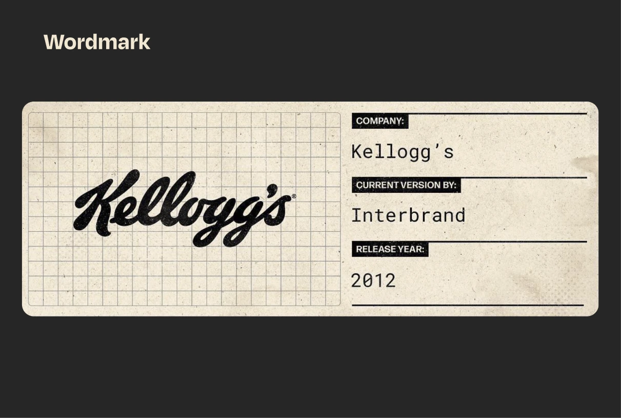
Wordmark
A wordmark (also called a logotype) is a type of logo that’s built entirely from the brand’s name, styled in a distinctive font or lettering. It comes without any extra icons, symbols, or graphics. It works best when a company has a short, memorable, and unique name, because the typography itself becomes the identity.
Example: Kellogg’s.
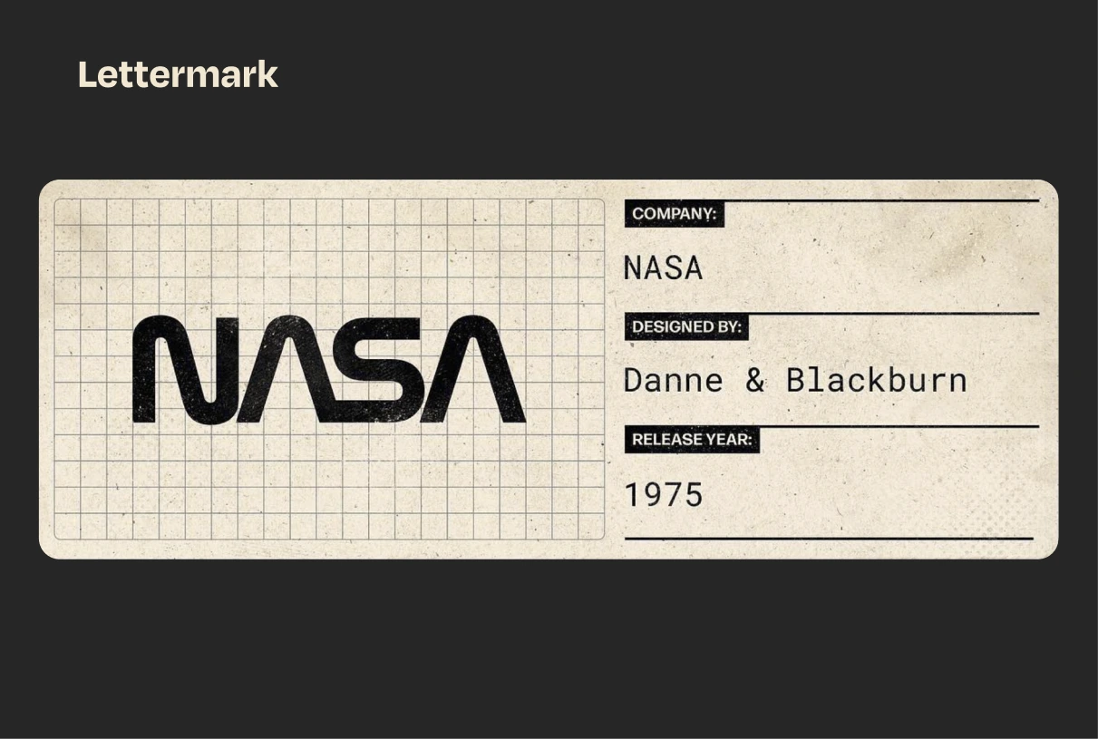
Lettermark
A lettermark is a type of logo made from a company’s initials or abbreviations, instead of spelling out the full name. It’s basically a monogram-style logo where typography does all the work.If your brand has a long or complex name, a lettermark simplifies it into something people can remember and recognize quickly.
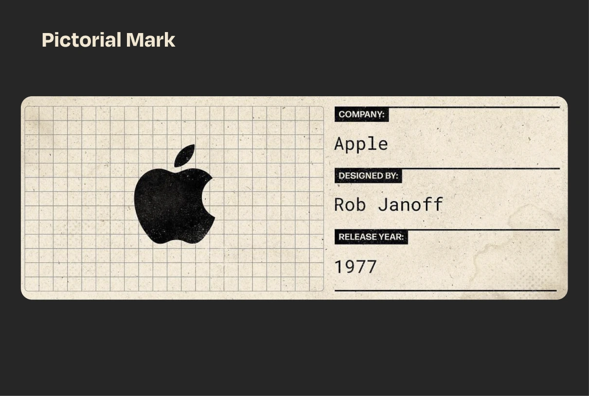
Pictorial Mark
A pictorial mark (also called a brandmark or logo symbol) is a logo built around a recognizable image or icon. Instead of focusing on words or letters, it uses a picture that represents the brand visually. Pictorial marks are powerful because images are easier to recall than words. Over time, a strong icon can stand alone without needing the company name.
Example: Apple
Abstract Mark
An abstract mark is a logo that uses a geometric shape or symbolic form instead of a literal picture. Unlike pictorial marks (which show something recognizable like an apple or a bird), abstract marks are more about capturing an idea, feeling, or brand essence in a unique visual. Abstract marks give you total freedom. You’re not tied to real-world objects, so you can create something distinctive and timeless that belongs only to your brand.
Example: Nike
Mascot
A mascot features a character or illustrated figure, often fun, friendly, or approachable, that acts as the brand’s spokesperson or ambassador. Instead of being just a symbol or text, it personifies the brand, making it more relatable, memorable, and most of all, it represents your Brand as a Human. Mascots create an emotional bond, appeal to families and children, and are especially effective for brands that want to feel warm, approachable, or entertaining.
Example: Michelin Man
Emblem
An emblem is where the text is enclosed within a symbol, badge, or crest. Think of it as a unified seal where words and imagery are locked together inside a shape. These often feel traditional, authoritative, or prestigious, which is why they’re loved by schools, sports teams, government agencies, and heritage brands.
Example: Harley Davidson
Combination Mark
A combination mark is a logo that blends text (wordmark or lettermark) with a symbol, icon, or mascot. The two elements can be used together or separately, making this one of the most versatile logo types. Combination marks build strong brand recognition by tying a visual image to the brand name. Over time, many brands can drop the text and still be recognized by the symbol alone.
Example: Pizza Hut
When we look at something, we don’t read first. Before anything else we see shape, we see colour, and if that’s enough to hold our attention, then we’ll read — David Airey
How to Design a Great Logo: Key Principles and Mistakes to Avoid
How do you actually create one? There’s a short list of principles you’ll hear a lot, simplicity, memorability, versatility, relevance, and timelessness, and they’re repeated because they work.
Simplicity helps a mark cut through visual noise and remain legible even at tiny sizes. Memorability is the brain’s reward for distinctiveness. Versatility means your mark functions in many contexts (print, motion, social avatars, embroidered merch), and relevance ties the design back to what you do and who you are. Last but definitely not the least, timelessness helps avoid constant redesigns that confuse customers.
The process then becomes part strategy, part craft, and part discipline.
1. Start with research/referencing, not sketches.
Understand your audience, competitors, and positioning. A logo that looks good but says nothing unique about your brand won’t stand out.
2. Find the core idea.
Every strong logo has a conceptual backbone, i.e, a story, a shape, a metaphor, or a type treatment that makes sense for the brand. Apple’s logo is one such example.
3. Sketch generously, refine ruthlessly.
Explore many directions at the rough stage. Then test each one against the principles of clarity, scalability, and distinctiveness.
4. Design with context in mind.
Don’t just see your logo on a white artboard. Mock it up on app icons, signage, packaging, and social avatars. A logo must perform in real life, not just on paper.
5. Balance structure and personality.
Grids and geometry create balance, but sometimes imperfection adds charm. A handcrafted wordmark can feel more human than a mathematically perfect curve.
You don’t want to cram every logo into a grid. Organic, hand-drawn, or highly expressive logos are best when they can breathe naturally. For those types, forcing a grid can kill their essence and uniqueness. The best logos are instantly recognisable, like McDonald’s arches or Nike’s swoosh.
6. Test for adaptability.
Shrink it down to 16px, blow it up on a billboard, strip it to black-and-white. If it still works, you’ve built an evergreen logo.
7. Protect it legally.
Run clearance searches, then trademark the final mark so your investment becomes defensible IP.
A logo’s role evolves as a company grows. Many iconic brands have refined their marks rather than replacing them; evolution keeps recognition intact while improving clarity for new formats. Think in terms of a mark system that can flex (icon, full lockup, wordmark) rather than a single static file.
Need A Logo Made?
Maybe you do. Maybe you’re considering it. But you have questions, some of which, we hope, this blog will help you answer. If not, you can reach out to us at hello@sparklin.com.
And yes, in case you were wondering, the design folks at Sparklin can help you build the ideal logo for your brand. Interestingly, we have decades of experience to show for it.
Frequently Asked Questions About Logo Design
How do I choose the right type of logo for my business?
A: Start with your brand identity. If your name is short and catchy, a wordmark might work best. If your brand relies on personality, a mascot could bring it to life. For global recognition, abstract or pictorial marks can be powerful. The right choice depends on your brand’s goals, audience, and long-term vision.
Do I need to register my logo as a trademark right away?
If you plan to scale, enter new markets, or build IP value, file sooner rather than later in key jurisdictions. At minimum, run clearance searches and document your first use and launch date. Trademark filing timelines and procedures differ by country (both the Indian trademark registry and the USPTO offer guidance) so consult a legal advisor for a filing strategy that fits your markets and budget.
What files and assets should I insist on getting from the designer?
Ask for vector master files (SVG/EPS), PNG exports at multiple sizes, an SVG icon for web use, a monochrome version, and a simple usage guide listing color values, typefaces, and minimum sizes. Also make sure you receive font license details or font files if the designer used a paid typeface.
When to DIY and when to hire a professional
Not every small business needs a multi-stage design system out of the gate. Some solo entrepreneurs do well with a tight, well-executed wordmark.
But when your business expects scale, multiple product lines, or to compete in crowded categories, hire a designer or studio that can offer concept depth, technical deliverables, and a legal-aware process. If budget is a constraint, aim for a minimum viable identity that includes a primary logo, an icon variant, color specs and a small usage guide. Investing in these basics saves time and money when you start to grow.
A few practical checks before you launch a logo
Before you finalize, look at the mark in grayscale, on small sizes (favicon, app icon), on big formats (hoardings), embroidered on fabric, and tested in monochrome printing. Do a quick similarity search online to spot existing marks that are dangerously close. Confirm font licensing and ensure you have vector masters.