


Money shapes behaviour differently from almost every other digital category.

TL;DR
Many fintech apps unintentionally increase financial anxiety by overloading users with competing actions, excessive recommendations, aggressive cross-selling, dense dashboards, and poorly timed interruptions. The strongest fintech experiences reduce cognitive load through clearer hierarchy, contextual explanations, calmer onboarding flows, thoughtful AI systems, and trust-led behavioural UX. As fintech products become increasingly similar in features, the ability to reduce mental effort is emerging as one of the most important competitive advantages in financial product design.
People rarely open a fintech app casually because financial interactions are usually tied to responsibility, uncertainty, urgency, or self-evaluation. Someone may be checking whether rent was deducted twice, trying to understand why a credit score suddenly dropped, calculating whether a purchase can wait until next month, or attempting to avoid missing a repayment deadline during an already stressful week.
Yet many fintech products today continue treating visibility as the primary measure of usefulness. Over the last few years, financial apps have evolved into dense ecosystems where investments, payments, rewards, insurance, taxes, loans, subscriptions, AI recommendations, and educational systems compete for attention inside the same interface, often without enough prioritisation guiding users toward what actually matters in that moment.
At Sparklin, while working across financial and high-trust digital ecosystems for brands such as ICICI Bank, Paytm, MicroSave Consulting, SaveSage, and Taxmann, one pattern repeatedly emerged during fintech UX audits and behavioural reviews. Users were rarely struggling because products lacked functionality. In most cases, the friction appeared because interfaces demanded too much interpretation too quickly, particularly during moments where users were already dealing with financial pressure or cognitive fatigue.
Cognitive Load In Fintech Apps Is Becoming A Serious UX Problem
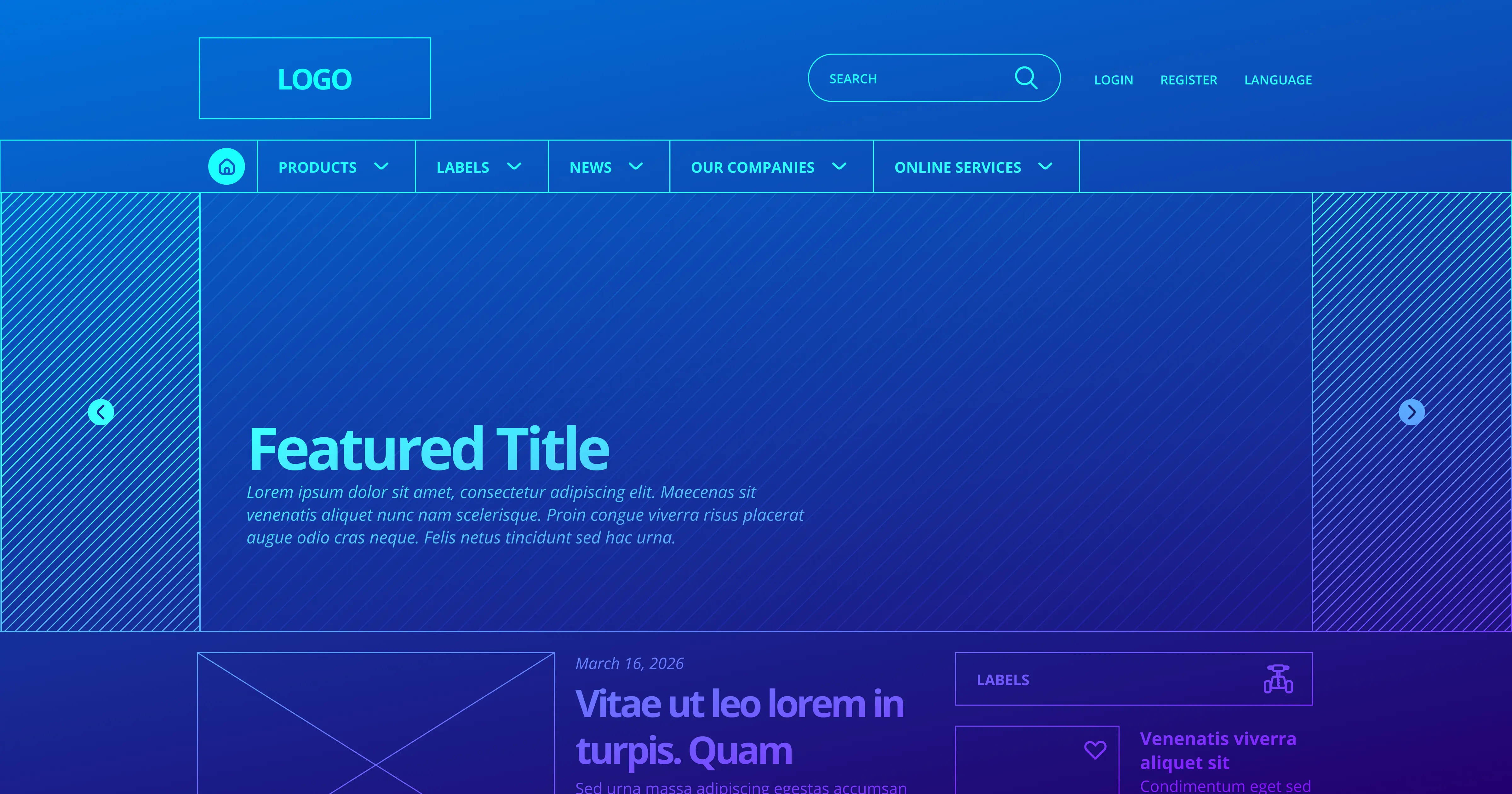
In one fintech dashboard audit, we encountered a homepage surfacing fourteen separate financial actions before the user had even scrolled once. Loan eligibility banners sat next to cashback modules, reward systems, investment prompts, transaction reminders, insurance recommendations, educational content, and market updates, all competing visually within the same viewport.

Individually, none of these systems was inherently flawed because each represented a legitimate business objective supported internally by different teams. The problem emerged from the combined experience. Users entering the app for a simple financial task were first being forced to separate relevance from noise.
Some of the strongest fintech interfaces solve this through progressive hierarchy rather than feature removal. Transaction-heavy products such as Google Pay or PhonePe often prioritise immediate actions like payments, balances, and recent activity first, while pushing secondary discovery systems deeper into the experience where users can engage more intentionally.
This distinction matters more in fintech than in many other categories because financial interfaces already carry pressure by default. Unlike social platforms, where users may browse casually, fintech products are frequently opened with a highly specific intent. Users often want immediate reassurance, confirmation, or clarity. They may want to verify whether a payment succeeded, check whether an EMI has been deducted correctly, locate an expense category, or understand what changed financially since the last interaction.
When the interface interrupts those priorities with too many competing systems simultaneously, the experience starts feeling mentally exhausting.
This becomes even more visible in markets like India, where users often manage multiple UPI apps, wallets, BNPL systems, bank accounts, and investment platforms simultaneously across fragmented devices, inconsistent connectivity, multilingual environments, and varying levels of financial literacy. Financial fatigue often exists before the product interaction even begins.
Under those conditions, strong fintech UX depends less on visual novelty and more on reducing unnecessary mental effort.
Financial Anxiety Changes The Way Users Read Interfaces
One of the most overlooked aspects of behavioural UX in fintech is that anxious users process information differently from relaxed users. During usability sessions, we repeatedly observed users skipping explanatory content entirely when dealing with financial uncertainty. Instead of carefully reading interfaces, they began scanning rapidly for familiar labels, confirmation states, or indicators suggesting safety and completion.
A highly detailed dashboard may appear comprehensive during internal reviews, but if users cannot immediately understand whether they are financially safe, overdue, eligible, or at risk, the interface begins increasing pressure instead of reducing it. Many fintech products unintentionally mistake information density for sophistication, which often results in interfaces that appear powerful internally but exhausting externally.
For example, displaying “Credit Utilisation: 42%” assumes users already understand the implications of that number. A clearer interface may instead explain that credit card usage has risen slightly this month and could affect the credit score if it remains consistently high. The information remains technically identical, but the second interaction removes the burden of interpretation from the user.

Some of the better financial products increasingly frame insights conversationally rather than numerically. Expense summaries, repayment reminders, and spending alerts are being rewritten in simpler language so users understand implication immediately instead of decoding raw financial terminology first.
Clarity cannot remain limited to visual cleanliness alone. It also depends on timing, sequencing, predictability, explanation quality, and the system’s ability to progressively guide users through decisions instead of confronting them with every possible capability simultaneously.
Dark Patterns In Fintech UX Are Starting To Damage Trust
As competition within fintech increases and customer acquisition costs continue rising, many products are under growing pressure to improve engagement, cross-selling efficiency, retention, and average revenue per user. These are legitimate business concerns, but they have also contributed toward interface behaviour that often prioritises visibility over trust.
This becomes especially visible during onboarding.
Onboarding has gradually become one of the most overloaded surfaces in fintech UX because products are simultaneously trying to establish trust, explain features, request permissions, promote rewards, surface monetisation systems, and collect behavioural data within the first few minutes of interaction. In practice, this often creates the opposite effect because users are being asked to trust a system before fully understanding what the system actually does.
The same pattern appears across homepage architecture and notification systems.
In several fintech audits, we noticed users repeatedly ignoring content-heavy homepage feeds despite substantial internal investment in financial education systems. Heatmaps showed that most users entered the app with highly task-oriented intent. They wanted to confirm transactions, verify repayment status, check balances, or locate specific financial information quickly.
The educational layer itself was not necessarily the issue.
The problem was timing.
Products were demanding exploration before resolving anxiety.
Products that handle this more effectively usually separate reassurance from exploration. Users first complete the task they entered for, after which the interface gradually introduces insights, recommendations, or educational content in less interruption-heavy ways.
Notification systems have become major contributors to financial fatigue. Spending alerts, cashback reminders, reward prompts, investment nudges, and urgency-led payment notifications may individually appear useful, but together they often create a background layer of financial surveillance that many users eventually begin tuning out entirely.
This is where fintech UX differs sharply from categories such as entertainment or e-commerce. Manipulative patterns inside finance products feel far more invasive because users are already operating inside environments shaped by risk and consequence. Hidden opt-ins, ambiguous repayment messaging, countdown timers, emotionally framed loan approvals, or overly aggressive “pre-approved” language may improve short-term conversion metrics while simultaneously weakening long-term trust.
The strongest fintech products understand restraint extremely well because financial confidence compounds slowly through predictability, transparency, and repeated low-friction interactions.
AI Personalisation In Financial Apps Needs Better Timing
AI-driven recommendations are rapidly becoming central to modern fintech experiences, but many products are currently approaching AI as a volume-generation mechanism rather than a decision-quality system. Users are increasingly receiving spending alerts, savings suggestions, investment prompts, risk indicators, reward recommendations, and financial summaries generated continuously through automated systems.
The problem is that recommendation overload eventually stops feeling intelligent.
If every transaction generates an insight, every spending category triggers advice, and every interaction produces a recommendation card, users eventually stop processing the system meaningfully because the interface begins feeling reactive rather than intelligent.
The more interesting AI patterns emerging in fintech are not recommendation-heavy systems. They are prioritisation systems that understand silence.
Instead of generating constant financial nudges, these interfaces surface intervention selectively, often reserving notifications for moments where behavioural change is actually possible rather than theoretically relevant.
For example, there is a significant difference between an AI system saying, “You spent 18% more on food this week,” versus saying, “You’re still within your monthly dining budget, so there’s no immediate action needed.” The second interaction reduces unnecessary concern instead of creating another decision loop for the user.
Some emerging fintech systems are already moving toward quieter AI models where recommendations appear contextually inside existing journeys instead of constantly pulling users into separate engagement loops. The interaction feels less like a notification engine and more like embedded financial assistance.
A user urgently checking whether salary has been credited requires a very different interaction model from a user casually exploring long-term investment planning during the weekend. As AI-led financial experiences mature, the real competitive advantage may not come from how much advice an app can generate, but from how accurately it understands timing, emotional state, and user confidence during decision-making moments.
Designing Fintech Apps For Trust Requires More Than Visual Polish
The strongest fintech products rarely feel simplistic, even though many are extremely sophisticated underneath. What separates them is their ability to progressively organise complexity rather than exposing every capability simultaneously.
The most effective financial interfaces reduce the amount of mental work users must do before acting. A repayment reminder becomes easier to trust when the interface clearly explains consequence, urgency, and next steps instead of merely surfacing another number inside a crowded dashboard. An onboarding journey becomes calmer when users understand why permissions are being requested before the system begins recommending financial products. A recommendation system feels more credible when it appears contextually instead of interrupting every interaction.
This is one reason some of the most trusted fintech products today feel operationally calmer despite handling extremely complex financial infrastructure underneath. The sophistication exists in the system architecture, but the interface itself reduces visible strain for the user wherever possible.
Accessibility becomes important here as well, particularly within the Indian fintech ecosystem where varying levels of financial literacy, language familiarity, and digital confidence significantly shape user behaviour. If interfaces rely too heavily on jargon, dense graphs, untranslated terminology, or unexplained financial metrics, they often exclude exactly the users who need clarity most.
At Sparklin, these realities have fundamentally shaped how we approach fintech UX systems, onboarding architecture, dashboard hierarchy, AI-led recommendations, and behavioural design within financial products. Increasingly, the fintech experiences creating the strongest long-term engagement are the ones reducing the highest amount of mental effort over time. They are often the ones reducing the highest amount of mental effort over time.
As financial products continue converging in features, this distinction will matter far more than many teams currently anticipate. Payments infrastructure can increasingly be replicated. AI tooling will become more accessible. Lending systems and investment capabilities are already becoming commoditised across the industry.
Reducing financial anxiety at scale, however, remains significantly harder because it requires products to understand not only interface behaviour, but also human behaviour under uncertainty.
Most users will never describe this difference as behavioural UX or cognitive load reduction.
They will describe it more simply.
One app feels stressful. Another feels manageable.
In fintech, that emotional distinction increasingly determines which products people continue trusting with their money over long periods of time.