


Onboarding Is Your First Impression And First Impressions Don't Get a Second Chance

TL;DR
Most users abandon apps during onboarding when friction delays them from experiencing real value. Slow onboarding flows, forced sign-ups, feature overload, unclear value propositions, and aggressive permission requests increase drop-offs before users fully understand the product. The strongest onboarding experiences reduce cognitive load, personalise the journey, and shorten time-to-value so users reach their first meaningful outcome faster. Effective app onboarding improves activation, onboarding completion rates, retention, and long-term user engagement by making the product feel intuitive from the very first session.
You've spent months building the product. The ads ran. The sign-ups came in. And then, just silence. Users arrived, poked around, and disappeared. If this sounds familiar, the culprit is almost always onboarding.
Onboarding is not a tutorial. It is not a welcome screen. It is the entire experience a user has before they decide whether your product deserves a place in their life. It is your product's handshake, its elevator pitch, and its first date, all compressed into a few critical minutes.
Research consistently shows that the window is brutally short. Most users form their first impression of an app within 30 seconds. By the end of day one, 25% have already left for good. By day three, that number climbs to 77%. No amount of re-engagement campaign spend recovers a user who decided in the first session that your app wasn't worth the effort.
The good news: onboarding is fixable.
Unlike product-market fit, which can take years to find, onboarding problems can often be diagnosed and resolved in weeks. This guide breaks down exactly why users leave, what the research and real-world examples tell us, and how to build an onboarding flow that converts curiosity into commitment.
What is Onboarding?
User onboarding is the process of helping new users understand a product, experience its value, and build enough confidence to continue using it. It includes every early interaction that shapes a first impression, from sign-up flows and personalisation to activation moments and retention nudges.
Good onboarding reduces confusion, shortens the path to value, and helps users feel progress quickly. The goal is not to explain every feature up front, but to make it feel natural and rewarding to continue using the product.\
Onboarding Starts Before the App Opens
Most onboarding conversations begin at the first screen inside the product. But users start forming opinions much earlier than that.
The onboarding experience often begins in the ad they clicked, the App Store screenshots they scrolled through, the landing page they visited, or the referral link a friend sent them.
Every touchpoint before sign-up creates an expectation about what the product will feel like.
If an ad promises simplicity but the first session feels overwhelming, trust in your product breaks instantly. If App Store previews showcase speed but the onboarding flow feels slow and demanding, users notice the mismatch immediately.
The strongest onboarding experiences feel consistent from the very first touchpoint:
- the messaging
- the visuals
- the tone
- the perceived effort
- the expected outcome
All align before the user even creates an account.
That consistency reduces skepticism and makes the product feel easier to commit to because the experience already feels familiar before onboarding officially begins.
The 6 Reasons Why Users Abandon During Onboarding
1. Too Many Steps Before the 'Aha!' Moment
Every additional step before users experience meaningful value increases the emotional distance between curiosity and reward. The longer that distance feels, the easier it becomes to abandon the process entirely.
Long forms, mandatory profile creation, permission prompts, and feature tutorials all push the payoff further away. Users are running a silent calculation the entire time: 'Is this worth my continued effort and my hard-earned money?'
The concept of the 'aha! moment' (the instant a user genuinely experiences value) is the centrepiece of effective onboarding. For Spotify, it's the first song playing. For Notion, it's the first note created. For Uber, it's seeing a car move toward you in real time. Everything before it is a barrier. Everything after it is retention.
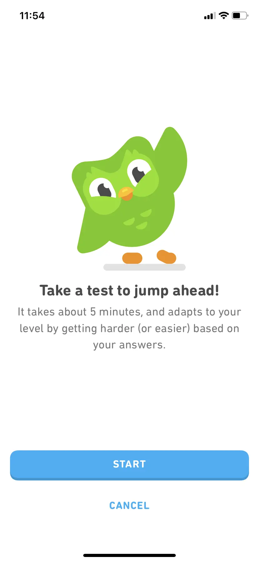
Real Example: Duolingo
Duolingo lets users complete their first full lesson before creating an account. By the time you've answered five questions, you've experienced the product's core loop with the reward, the streak, the dopamine hit. This is one reason Duolingo’s onboarding is often studied as a strong example of value-before-registration design. The lesson is the hook; the account is the lock.
What Duolingo understands particularly well is that motivation compounds once users feel progress emotionally. After the first lesson, the experience already feels rewarding enough that account creation no longer feels like an interruption. It feels like a continuation.
Fix: Map your onboarding backwards from your 'aha!' moment, then remove every step that isn't strictly necessary before it. Profile photos, notification preferences, and referral prompts can all wait.
2. Information Overload and Feature Dumping
New users do not need to know everything on day one. Yet many apps introduce every major feature through a rapid-fire sequence of tooltips, modals, and carousels. Cognitive load theory tells us that working memory can hold only around seven items at once, and a 12-step feature tour blows past that limit in the first minute.
Most users do not mind that the product offering is complex. They usually dislike a product because the experience asks them to process too many decisions before they have built enough mental context to care about those decisions.
Tooltips get dismissed. Feature tours get skipped. And the user is left exactly where they started: confused, underwhelmed, and unlikely to return.
Real Example: Canva
Canva avoids this problem by making users successful almost immediately. Instead of introducing the full complexity of the platform upfront, it starts with templates, suggestions, and familiar formats that reduce decision fatigue early in the experience.
Fix: Design for one core action per session. Use contextual onboarding with surface guidance precisely when the user is at the step that needs it, not before.
3. Asking for Too Much Personal Data Too Soon
Requesting access to contacts, location, notifications, or a credit card before a user has any reason to trust you is a conversion killer. According to Localytics, apps that request permissions in the first session see up to 60% lower opt-in rates compared to apps that wait until the user understands the value being unlocked.
Users have become acutely privacy-conscious. An upfront permission request, especially one without a clear explanation, signals that the app prioritises its own data needs over the user's experience.
Trust during onboarding behaves asymmetrically. It builds gradually, but can weaken almost instantly. A permission request at the wrong moment creates suspicion before confidence has had time to form.
Real Example: Airbnb
Airbnb only requests location access after a user has started searching for a destination. The prompt is framed as 'Help us find places near you', making it feel like a user benefit rather than a data grab. This contextual framing significantly increases permission acceptance rates.
Fix: Use contextual permission requests. Ask only when the feature requires it; always explain the benefit first; and never block the core experience behind an optional permission.
4. Unclear Value Proposition
If users cannot articulate what your app does for them within the first minute, they will assume it is not for them. A vague tagline, a generic welcome screen, or feature-first language ('AI-powered productivity tool') fails to answer the one question every new user is asking: 'What changes for me if I use this?'
Users are not only evaluating utility during onboarding. They are subconsciously evaluating fit. Does this product feel relevant to the kind of person they believe themselves to be?
This is especially damaging in crowded categories like fitness, fintech and productivity, where users have already tried multiple alternatives and are highly skeptical of empty claims.
Real Example: Headspace and CRED
Headspace opens onboarding with a single question: 'What brings you here?' The user's answer, stress, sleep, focus, anxiety, reshapes the entire experience. Every subsequent screen speaks directly to that stated need. Churn in the first week dropped significantly after this personalisation change was introduced.
CRED approaches onboarding differently by framing exclusivity itself as part of the product experience. The onboarding flow does not simply explain features. It reinforces identity, aspiration, and belonging from the very beginning.
Fix: Lead with outcome-focused language ('Save 3 hours a week on scheduling') rather than feature-focused language ('AI-powered calendar tool'). Use social proof early and personalise based on the user's stated goal.
5. Poor Mobile Experience and Performance Issues
Google found that a 3-second delay increases bounce probability by 32%, but mobile onboarding studies from AppsFlyer also show that users who experience friction in the first session are 2.7x less likely to return by Day 7. On mobile, users are even less forgiving and during onboarding, when first impressions are being formed, a crash, a frozen animation, or a broken layout on a budget Android device is an instant exit trigger.
Performance issues create a specific kind of anxiety during onboarding because users still have not built enough trust in the product to tolerate uncertainty. Slowness early on often gets interpreted as unreliability.
This is especially critical in high-growth markets like India, Southeast Asia, and Latin America, where mid-range devices and variable connectivity are the norm. Apps optimised only for flagship hardware will haemorrhage users in these markets specifically during the onboarding phase.
Real Example: Robinhood
Robinhood engineered its onboarding specifically around perceived speed. The initial screen load and account verification flow were stripped of all nonessential animations and API calls. Their onboarding completion rate significantly outpaces traditional brokerage apps, partly because the experience feels instant even when it isn't.
Fix: Test onboarding on real, budget devices not just simulators. Optimise your first screen to load in under 1.5 seconds. Avoid stacking full-screen modals; they create visual confusion and a sense of being trapped.
6. Forced Account Creation Before Value Delivery
Mandatory sign-up before any product experience is one of the biggest conversion walls in digital products. A user arrives, curious, often via a friend's recommendation or a social media post, hits a registration form, and immediately bounces. They have zero context, zero investment, and zero reason to hand over an email address.
**Registration asks users for commitment. Commitment feels natural only after users believe the product deserves space in their lives.
Real Example: TikTok and Figma
TikTok allows users to scroll, watch, and fully engage with content before requiring an account. By the time a user encounters the soft gate, 'Sign up to follow this creator'. They are already invested in the feed. The app has earned the right to ask for registration because it has already delivered value.
Figma’s onboarding becomes significantly more compelling once collaboration begins. The first moment users see another cursor moving live inside a shared canvas, the product immediately becomes harder to abandon because the experience now contains participation, not just utility.
Fix: Offer a 'try before you commit' experience wherever possible. Enable social login (Google/Apple) to reduce form friction. If multi-step registration is unavoidable, always show a progress indicator so users know how close they are to being done.
The Psychology Behind Onboarding Drop-Offs
Behind every abandoned screen is a cognitive or emotional trigger. Understanding these principles helps you design flows that work with human behaviour rather than against it.
- Effort-Value Equation
Users constantly calculate whether the reward is worth the effort. If the perceived effort outweighs the perceived value at any step, they leave. - Cognitive Load Theory
Working memory can only process a limited amount of information at once. Introducing too many features, actions, or decisions simultaneously creates confusion, fatigue, and drop-offs. - Privacy Calculus
Users weigh the benefit of sharing personal data against the perceived risk. Asking for sensitive information before trust is established often pushes users toward abandonment. - Goal Gradient Effect
People become more motivated as they feel closer to completing a goal. Progress indicators like “Step 2 of 4” create momentum in a way a blank or undefined flow never can. - Identity Alignment
Users are more likely to adopt products that reflect who they are or who they aspire to become. Onboarding questions around goals and preferences signal that the product understands them personally. - Loss Aversion
People are psychologically more motivated to avoid losing something than to gain something new. Framing onboarding steps as “unlocking features” instead of “completing tasks” taps into this bias and encourages action.
Great Onboarding Builds Emotional Momentum
The strongest onboarding experiences create momentum instead of merely removing obstacles.
That distinction matters because users are often willing to tolerate effort when the feeling of progress keeps increasing.
Some of the most successful onboarding systems are not especially short:
- Duolingo asks users to complete lessons
- Airbnb gradually builds trust signals
- Figma introduces collaboration dynamics
- TikTok continuously improves feed relevance
Yet users continue because every interaction increases emotional investment. Good onboarding creates the impression that the product becomes more valuable with every step forward.
This is why progress matters more than simplicity alone. A short onboarding flow that feels emotionally flat can still fail. A longer onboarding flow with increasing momentum often succeeds because users no longer feel like they are “completing setup.” They feel like they are already inside the experience.
The Economics of Bad Onboarding
Poor onboarding is often treated as a UX issue.
In reality, it is one of the most expensive growth problems a product can have.
Every user who drops during onboarding is paid acquisition spend that never reaches monetisation. The ads worked. The downloads happened. Interest existed. But the product failed to convert curiosity into activation.
This is why onboarding sits at the intersection of:
- product
- design
- retention
- growth
- revenue
A small improvement in onboarding completion rate can dramatically change a product's economics because retention compounds over time. If 1,000 additional users successfully activate every month:
- more users return
- more users subscribe
- more referrals happen organically
- customer acquisition costs become easier to recover
- lifetime value increases without increasing ad spend
The strongest growth teams treat onboarding as a retention lever, not just a setup flow.
Because acquisition gets users in the door. Onboarding determines whether they stay long enough for the business model to work.
What the Best Onboarding Systems Understand About Human Behaviour
These are the patterns that separate apps with 70%+ onboarding completion rates from those stuck below 30%:
- Show value before asking for anything. Commitment feels natural only after emotional investment begins. Users are far more willing to register, pay, or share information once the product already feels useful enough to lose. The ask is far easier once they're already invested.
- Use a single personalisation question. Personalisation works because it changes the emotional framing of the experience. The moment users feel the product is responding specifically to them, attention increases and skepticism drops.
- Display a visible progress indicator. Uncertainty creates abandonment faster than effort does. Progress indicators reduce ambiguity and make users emotionally commit to finishing what they already started.
- Design backward from the 'aha!' moment. The strongest onboarding flows are designed around emotional payoff, not feature explanation. Users stay engaged when each step increases anticipation for what comes next.
- Offer social login as the primary option. Sign in with Google or Apple reduces form fields from five or more to a single tap a consistently proven conversion lift across categories. Every additional field gives users another moment to reconsider whether continuing is worth it. Social login works because it preserves momentum at the exact point where hesitation usually appears.
- Anticipate the user's next step before they do. Great onboarding is predictive, not reactive. Designers should always ask: 'What will the user want to do next?' and then make that action as easy as possible, surfacing it before the user has to search for it. The best flows feel effortless because the product always seems to know where the user is headed.
- Celebrate the first success. A small animation, a congratulatory message, or a progress milestone after the user's first meaningful action matters because users emotionally anchor themselves to progress very quickly through these small wins. The first successful interaction often determines whether the product starts feeling rewarding or forgettable.
- Send a re-engagement nudge within 24 hours. Interest decays surprisingly fast after the first session. Re-engagement works best when it reconnects users to the momentum they had already started building rather than simply asking them to return. A push or email tied to the user’s stated goal works better than a generic “Come back!” because it reconnects them to the progress they had already started.
- Make skipping possible but not the default. Always allow users to bypass optional steps, but design the primary path to guide them through the full flow. Forced flows create resistance because they remove a user’s sense of control. Giving users flexibility makes the experience feel collaborative rather than restrictive.
- Drop-offs are rarely random. Small emotional reactions compound silently throughout onboarding, which is why step-level analysis matters far more than overall completion percentages alone.
Common Onboarding Mistakes by Industry
Different categories create different onboarding challenges. The mistakes are often predictable because user expectations vary from industry to industry.
Fintech Apps
Many fintech products ask for KYC, bank linking, or credit card information before users fully understand the value of the product.
Others overwhelm first-time users with dense dashboards, investment terminology, charts, and too many financial decisions upfront.
The strongest fintech onboarding flows build trust gradually and simplify the first session into one clear outcome.
Productivity Apps
Productivity tools often try to showcase every capability immediately via templates, automations, integrations, workspace setups and team invites.
Instead of helping users complete one meaningful task, the onboarding becomes a feature catalogue.
The best productivity products focus on helping users achieve one small win quickly before expanding the experience.
EdTech Apps
Many learning platforms force users into curriculum selection before understanding:
- learning goals
- skill level
- preferred pace
- motivation style
This creates friction before emotional investment exists.
The strongest onboarding flows personalise the experience gradually and reduce the pressure of making the “perfect” learning choice immediately.
Health and Wellness Apps
Health products often ask for deeply personal information too early, which can make users reluctant. Without established trust, these requests can feel invasive rather than helpful. The best onboarding experiences explain why information such as medical history, weight, mental health inputs and lifestyle habits matter and allow users to build confidence in the product before sharing sensitive details.
Metrics That Actually Matter
Many teams measure onboarding success using completion rates alone. But completion does not always mean activation. A user can finish onboarding and still never meaningfully adopt the product.
The strongest product teams track onboarding using a combination of behavioural and retention metrics:
Activation Rate
The percentage of users who reach the product’s core value moment.
Onboarding Completion Rate
How many users successfully finish the onboarding flow.
Time-to-Value
How quickly users experience the first meaningful benefit.
Day 1 and Day 7 Retention
Whether users return after the first session and continue building a habit.
Permission Acceptance Rate
How effectively contextual permission requests are working.
Signup Conversion Rate
The number of users continue from product exploration into account creation
Step-by-Step Drop-Off Rates
The exact screen or action where users abandon the experience. Without step-level visibility, onboarding optimisation becomes guesswork instead of iteration.
Dark Patterns in Onboarding
There is a difference between guiding users and cornering them. A lot of onboarding flows blur that line.
You open an app, and before you have even understood what it does, there is already pressure waiting for you. Notifications. Contact access. Countdown timers. Free trials with urgency language. Progress bars that suggest you are “almost done” even though the process has barely started.
The intention behind these patterns is usually simple: increase conversion numbers quickly.
And sometimes they work.
A more aggressive onboarding flow can absolutely improve opt-ins or sign-up rates in the short term. But products rarely talk about the second-order effect of that experience. Users remember when something felt manipulative. Even if they continue initially, trust becomes weaker from the very beginning.
That matters because onboarding is not only about getting users through a flow. It is about shaping their first emotional impression of the product.
The best onboarding experiences create clarity without pressure. They help users move forward confidently instead of nudging them into decisions they are not ready to make yet.
People are surprisingly forgiving of products that feel imperfect.
They are much less forgiving of products that feel dishonest.
The Future of Onboarding Is Invisible
The most effective onboarding flows usually do not feel like onboarding. You are not sitting through explanations, memorising features or being interrupted every few seconds by another tooltip trying to “educate” you.
You are simply using the product.
And somewhere along the way, without consciously noticing it, things start making sense.
The next action feels obvious. The interface begins feeling familiar. The product responds the way you expect it to. Good onboarding creates a rhythm where uncertainty keeps shrinking with every interaction.
That is why the strongest onboarding experiences rely less on instruction and more on momentum.
A lot of products still treat onboarding like a guided tour. But users rarely want a tour. They want progress and to feel capable quickly, with enough clarity to continue without constantly stopping to think about how the system works.
The products that retain users best understand this deeply. They reveal complexity gradually. They teach through interaction instead of explanation. They let confidence build naturally over time.
And this is increasingly where onboarding is headed.
The future of onboarding will feel far more adaptive, contextual, and invisible than the rigid setup flows most products still rely on today. Products are becoming better at understanding intent, predicting behaviour, and personalising experiences in real time. The onboarding experience will reshape itself around the user instead of forcing every user through the exact same sequence.
The best onboarding systems of the future will not feel like “flows” at all. They will feel like products that immediately understand where users are.
And in a market where users have endless alternatives and almost no patience, that difference becomes incredibly important very quickly.
Onboarding Audit Checklist
Here is a checklist that you can share it with your design and product team to identify gaps in your current onboarding flow:
- Users can experience the core product value before being required to register
- Sign-up can be completed in under 60 seconds using social login
- The onboarding flow includes a visible progress indicator
- The first 'aha!' moment occurs within 90 seconds of opening the app
- Permissions are requested contextually, never upfront, always with a clear benefit statement
- The first session ends with a specific, personalised call to action
- A re-engagement message is sent within 24 hours of sign-up
- Drop-off is tracked at every individual step in the funnel
- The flow has been tested on real, budget Android devices
- Designers have mapped the user's anticipated next step at each stage and made it the easiest action to take