

Every tap, click, or swipe starts with a clue. Signifiers in UX act as these clues, helping users understand what’s interactive, what’s next, and how to move through a product effortlessly.
When you reach for a door and see the word Pull written on the handle, you don’t hesitate. That little word is not the action itself and nor the handle’s shape either. It’s a signifier, a cue that guides you toward the right interaction. In digital design, these cues are everywhere, from labels on buttons to arrows on scroll bars. Without them, even the smartest affordances risk being misunderstood.
Origin of Signifiers
The concept of signifiers traces back to Ferdinand de Saussure, a linguist who founded the field of semiotics, i.e., the study of signs and symbols. In Saussure’s framework, a sign consists of two parts:
- The signifier (the form, such as a word, sound, or symbol), and
- The signified (the concept it represents).
His framework was meant to explain language and communication, but the principles of cues and meaning reached far beyond linguistics.
Decades later, the father of UX design, Don Norman adapted the idea for product and interface design. In his bookThe Design of Everyday Things, he separated affordances (what actions are possible with an object) from signifiers (the perceivable indicators of those actions). Norman’s unique insight was that affordances exist whether or not people notice them, but signifiers ensure people recognize them.
Evolution of the Concept ‘Signifier’
In the early days, examples of signifiers were largely physical: handles, switches, knobs, and labels. The handle on a teapot affords gripping, while a small Caution: Hot label serves as a signifier. With the rise of digital interfaces, these cues migrated to the screen. A scrollbar affords movement, meaning it lets you scroll the page up or down, and the small arrows show which direction to go.
When design switched from realistic, 3D-looking buttons to flat, simple ones, people got confused about what to click. Without clear clues, users hesitate, take longer, and make more mistakes. It’s not enough for something to be clickable—it has to look clickable. Affordances may exist in theory, but they only become useful when signifiers make them perceivable.
Today, signifiers are dynamic. They no longer just hint at what’s possible; they also provide feedback once actions are taken. For example, a tiny arrow might show that you can swipe, and when you actually swipe, the app might confirm it with a vibration, animation, or success message. In other words, signifiers now guide you and reassure you at the same time.
Modern Use Cases
Signifiers shape nearly every digital experience. Navigation controls rely on them: arrows that point forward or back, icons that expand menus, or underlined blue text that signals a link. Forms, placeholders, floating labels, and inline error messages guide users toward correct input. Mobile gestures need explicit hints like arrows or animations because you can’t see them on the screen.
Even voice interfaces depend on signifiers. Audible prompts such as “You can say ‘What’s the weather?’” let users know what commands are available. Accessibility brings another dimension for users who cannot rely on visuals, alt text, ARIA (Accessible Rich Internet Applications) roles, or tactile feedback must act as effective signifiers. Without these cues, entire interactions remain hidden.
Today, signifiers have become much more subtle that sometimes, you don’t even notice them at first. Modern apps and websites often look clean and simple, so it’s not always obvious what you can tap or swipe. For instance:
1. On Instagram, the heart icon clearly shows you can like a photo, but the double-tap gesture is hidden, you only discover it by trying or being told.

2. On Twitter/X, the three-dot More Options menu is a hidden signifier that users learn to recognize over time.
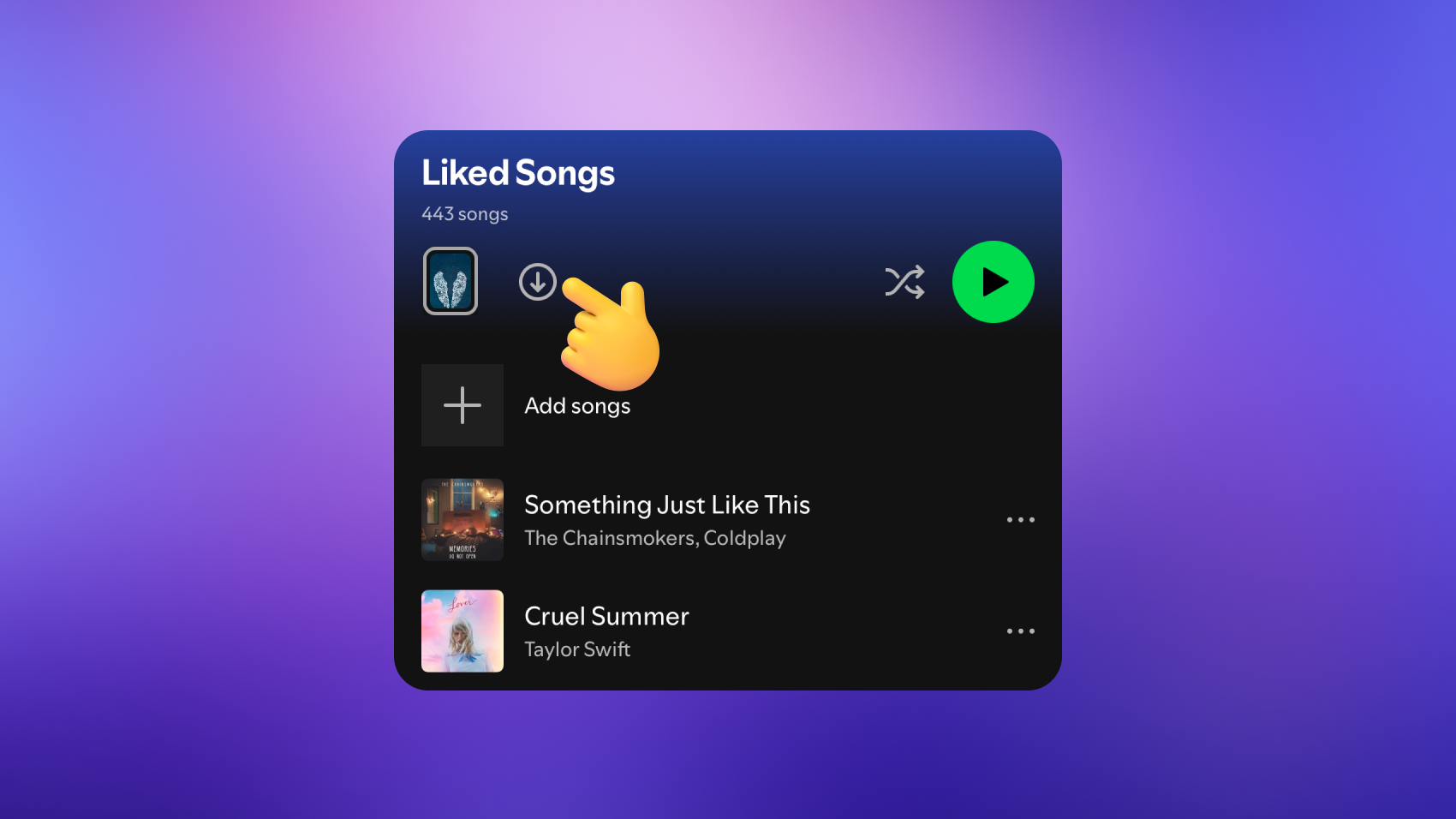
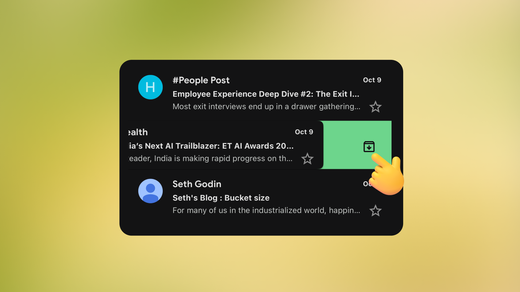
3. On Spotify, in Liked Songs and playlists, the Download arrow (↓) icon means Save Offline, but new users may not get it right away.
4. On Gmail, swiping left or right on a message archives it. A handy shortcut, but one without upfront signifiers.
Take something as simple as hyperlinks. People think the underlined blue text is the affordance. The webpage text affords being clicked. The blue underline is the signifier telling you that this is clickable.
Affordances vs Signifiers: What’s the Difference?
Although the two terms are linked, they describe different layers of interaction.
Affordances are what something allows you to do. For example, the shape of a steering wheel lets you turn it, and a light switch lets you flip it on or off. Signifiers are about communication: arrows on the scrollbar, labels on a switch, or icons on a wheel that tell you what else you can do.
Think of a door. Its handle may afford pulling, but without a label you might push instead. Or consider a digital button. It affords clicking, but unless it is styled to look interactive, users may ignore it. When affordances and signifiers align, interfaces feel natural. When they diverge, frustration sets in.
As technology keeps changing, these small cues will decide whether an experience feels smooth and empowering or frustrating and unclear. In the end, good UX is about the actions a product allows, while building the confidence users have in knowing what’s possible. That confidence always starts with a signifier.
Designing Signifiers That Work
- Good signifiers are perceivable; users must be able to see, hear, or feel them.
- If users can’t perceive a signifier, it fails, no matter how clever the design is.
- Effective design relies on familiar conventions (like underlined links or trash-can icons) to reduce cognitive effort.
- Consistency across a product helps users apply what they’ve already learned to new contexts.
Testing and Validation
- First-click tests show if users know where to act without hesitation.
- High success rates and shorter completion times usually indicate clear signifiers.
- A/B testing helps refine wording or icon styles.
- Support tickets can reveal where signifiers are unclear or failing.
- Accessibility testing ensures all cues work for everyone, including users who don’t rely on sight.
The Future of Signifiers
Tomorrow’s interactions may not revolve around buttons or icons at all. Voice assistants like Alexa or Siri already show how a simple spoken cue replaces visual signifiers, guiding you through tone and language alone. In augmented reality, glowing frames or highlights can signal where objects belong. Imagine seeing the outline of a sofa snap into place in your living room. Virtual reality takes it further: a slight vibration in the controller tells you an object is within reach, no visual confirmation required.
Even shopping is evolving.
Smart mirrors might spotlight clothes in your size, while AR-enabled shelves could shimmer subtly to reveal what’s on sale.
And with AI steering interfaces, signifiers may become anticipatory rather than reactive, surfacing the right cue at the right moment without crowding the experience. The design challenge will be keeping them clear, trustworthy, and easy to interpret, no matter how invisible or intelligent they become.