

Every rebrand seems to arrive with an explanation. There is usually a blog post outlining the thinking, a carefully worded announcement assuring customers that the company is still the same at heart, and a flurry of reactions that focus, almost exclusively, on the most visible change. The logo. The colours. The typeface. Whether it feels “modern enough.”
This attention is understandable. Visuals are the only part of a rebrand most people ever encounter.

TLDR:
What is Rebranding?
Rebranding is a strategic reset that realigns how a company is perceived with what it truly stands for and offers. It is a lot more detailed than a new logo or a color change. True rebrands reshape core elements such as name, messaging, positioning, and visual identity to close the gap between internal reality and external perception, making the brand clearer, more relevant, and easier to choose for the right audience.
What is the difference between Brand Refresh and Rebranding?
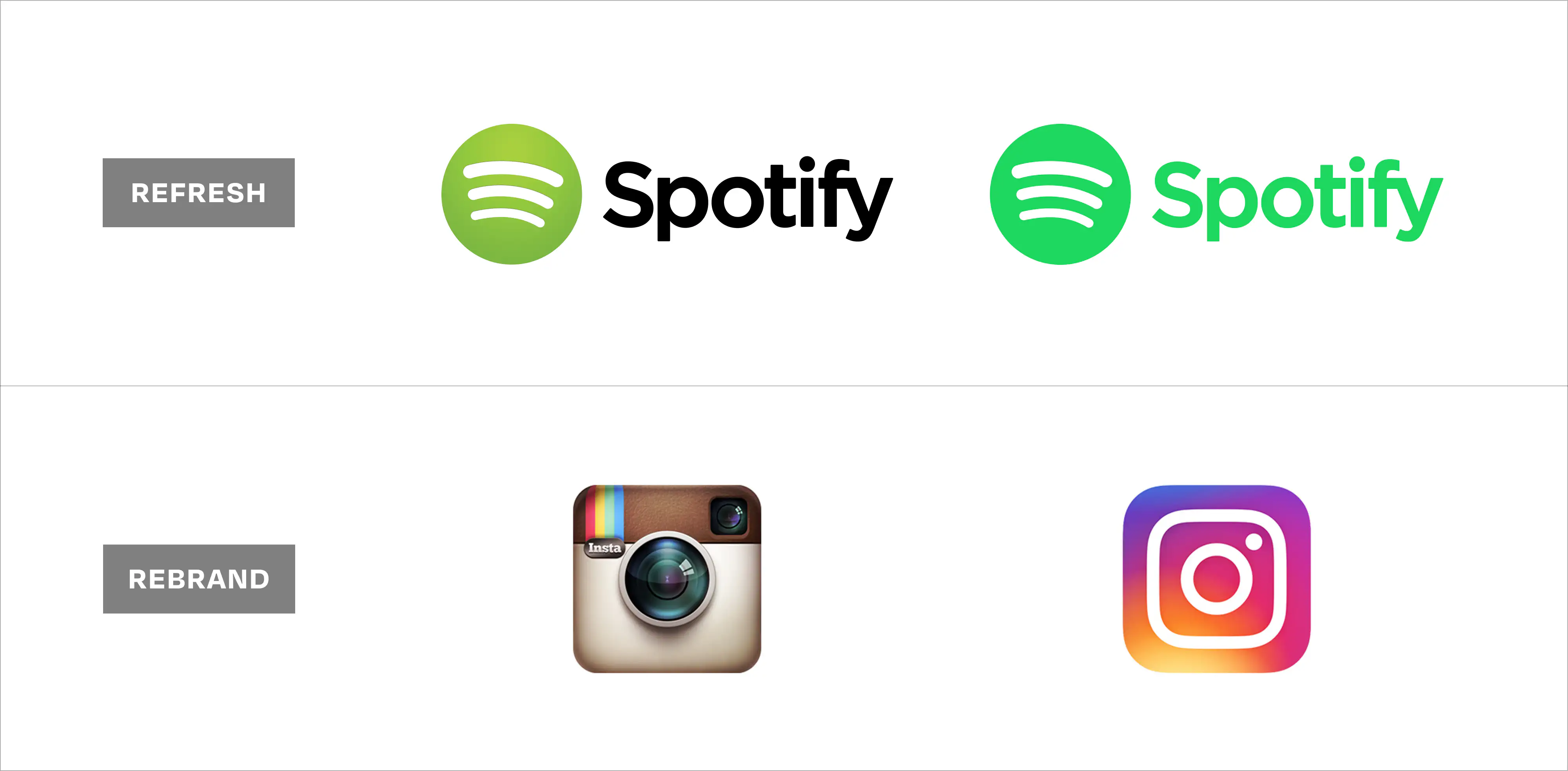
A brand refresh updates how a brand looks and sounds, without changing its personality, positioning or perception. Unlike a simple brand refresh, rebranding becomes necessary when business evolution, market shifts, or audience confusion reveal a deeper misalignment that surface-level updates cannot fix. Done well, a rebrand improves understanding, conversions, and competitive differentiation without alienating loyal customers.
Inside companies, rebranding is rarely triggered by aesthetics. It begins elsewhere. Often in moments that feel operational rather than creative. Sales teams find themselves explaining the business too frequently. New customers misunderstand what the company actually does. Leadership realizes that different teams are describing the same organisation in slightly different ways.
In those moments, perception is shaped by clarity, not aesthetics.
At its best, rebranding is an effort to close the gap between how a company sees itself and how it is understood.
Rebranding Defined
Rebranding is the process of changing how a company presents itself to the world, but more fundamentally, it's about realigning external perception with internal reality.
The term gets applied loosely. A new logo appears and someone calls it a rebrand. A website gets redesigned and the announcement uses the same language. But true rebranding goes deeper than visual updates. It involves reconsidering and often reshaping the core elements that define how a business is understood: its name, positioning, messaging, visual identity, and the experience it creates across every interaction.
Rebranding becomes an act of strategic translation. Taking what a company has become and finding the clearest way to communicate that to the people who need to understand it.
Consider what Dunkin' did in 2019. The company dropped "Donuts" from its name after 68 years. The visual change was minimal, with cleaner typography and the same orange and pink. But the positioning shift was significant. Dunkin' had spent years expanding its beverage menu and trying to compete in the coffee space dominated by Starbucks. The old name anchored perception to a product category the company was trying to move beyond. Keeping "Donuts" in the name meant every customer conversation started with an outdated assumption about what the business primarily offered.
The Dunkin’ rebrand acknowledged the company’s true position in customers’ lives: a beverage-first chain that also sells donuts. That clarity made it easier for people to choose Dunkin’ for their everyday coffee routine, not just an occasional donut run. Tactically, Dunkin’ removed “Donuts” from signage, refreshed packaging and in-store layouts to prioritise beverages, expanded its espresso and cold drink range, and redesigned drive-thrus to optimise for coffee orders. The shift was subtle visually, but transformational in how customers understood the business they were choosing.
Or look at Mailchimp's 2018 rebrand. The email marketing platform had expanded into a full marketing suite, including CRM tools, ads, landing pages and automation. But the playful, approachable brand identity that worked brilliantly when they were a scrappy underdog felt increasingly misaligned as they competed with enterprise marketing platforms. The rebrand introduced more sophisticated design, mature messaging, and positioning that spoke to serious marketing teams, expanding it from its niche of targeting just small business owners experimenting with email.
Existing customers barely noticed. New prospects, particularly those at larger companies with complex marketing needs, suddenly saw Mailchimp as a credible option. The rebrand broadened the frame, allowing more people to see the product as relevant to their lives. The rebrand also centralised its brand system: a unified yellow palette, stronger illustration style, clearer product naming, and messaging around “growing businesses”; helping reshape perception from email tool to full-scale marketing platform.
Here, visual maturity legitimized expansion: positioning made the new product story believable.
Burger King's 2021 rebrand took the opposite approach: moving backward to move forward. The fast food chain had used a glossy, heavily stylized logo since 1999, complete with a blue crescent and dimensional effects that felt very much of its era. The rebrand reached back to the company's 1969-1999 identity with flat colours, rounded typeface and simplified forms. Burger King was repositioning around food quality and ingredients during a period when consumers increasingly valued authenticity over artificial perfection. The retro aesthetic communicated "real food" more effectively than the plastic sheen of the previous identity. Sales and brand perception improved, particularly among younger customers who had no memory of the original logo but responded to what felt like an honest, unfussy design. Beyond the logo, Burger King updated its uniforms, packaging, menu boards and restaurant interiors to feel warmer and more ingredient-first so the visual identity matched the food quality story in every touchpoint.
When perception drifts toward inauthenticity, the most strategic move can be a return to the truth of the brand.
The scope varies. Sometimes rebranding means a complete overhaul: new name, new visual system, new market positioning, new messaging architecture. Other times it's more contained: updated positioning with refreshed visuals, or a new name but maintained equity in colour and tone. The scale depends on how significant the gap is between perception and reality.
But in every case, the objective is the same. Making it easier for the right people to understand what you offer, why it matters, and whether it's meant for them.
.webp)
The Difference Between a Brand Refresh and a Brand Rebrand
A brand refresh updates the surface-level elements of your product/company's identity, such as colour palettes, logo refinements, and a refined tagline—without changing the brand’s core strategy. The underlying business remains unchanged. The audience stays the same. The market position holds steady. These updates can feel significant internally while registering as barely noticeable to customers.
A rebrand, different than a brand refresh, signals a shift in what the business represents. It might follow a merger, a pivot in business model, or an expansion into markets that require different positioning. Sometimes it corrects a fundamental misalignment, for example, when a company that started selling one thing has quietly evolved into something else entirely, but still carries the identity of what it used to be.
The distinction matters because the process, investment, and internal disruption differ considerably. A refresh can happen in weeks with a small team. A rebrand often takes months and requires coordination across every customer touchpoint. It sure does affect marketing materials, but even sales scripts, product packaging, support documentation, hiring language and even the way employees introduce themselves at conferences need to be revamped.

When Rebranding Becomes Necessary
When a company outgrows its brand, the signs appear gradually. Small signals accumulate until leadership can no longer ignore the pattern.
The company attracts the wrong customers. Leads arrive expecting a different service, pricing tier, or level of sophistication. Sales teams spend early conversations managing expectations rather than building interest. This misalignment creates friction that compounds over time, affecting both conversion rates and customer satisfaction.

Burberry faced this exact problem in the early 2000s. The luxury brand had become associated with counterfeit goods and a particular subset of British culture that didn't align with high-end fashion positioning. The iconic check pattern appeared on everything from baseball caps to dog collars, sold at discount retailers.

Luxury customers who might have considered Burberry were put off by the association. The rebrand under Angela Ahrendts involved pulling back on logo-heavy products, tightening distribution, elevating the aesthetic, and refocusing on craftsmanship and heritage. Burberry didn't change what it made. It corrected who it attracted. By stripping away misuse and reclaiming its narrative, Burberry regained control over who it attracted.
Starbucks navigated a similar challenge in 2011 when it dropped "Coffee" from its name. Like Dunkin' years later, Starbucks had diversified well beyond its original category. The company sold tea, food, packaged goods and even music. But "Starbucks Coffee" locked perception to a single product line. The rebrand simplified to just the siren mark with no text or category descriptor. This freed Starbucks to expand into new offerings without customer confusion. When the company launched juice bars or premium tea lines, the brand identity didn't conflict with these extensions.
The business had already evolved; the brand just needed to catch up.
Removing the category label unlocked the growth the brand had already earned operationally.
Airbnb's 2014 rebrand reflected this evolution. The company started as a platform for booking spare rooms and air mattresses that was a budget alternative to hotels. By 2014, Airbnb hosted entire homes, luxury properties, and experiences beyond accommodation. The original logo (a stylized 'A' that read more like a tech startup) and the positioning around "cheap places to crash" no longer matched what the platform offered or who used it. The new identity, the now-famous Bélo symbol, aimed to represent belonging, community, and a broader vision of travel. Love it or hate it aesthetically, the rebrand signalled that Airbnb had moved from disrupting budget travel to reimagining travel itself.
These transitions share a common thread: the business model evolved faster than the brand could accommodate. But misalignment doesn't always stem from growth. Sometimes it emerges from internal drift.
Internal language has diverged from external language. Employees describe the company one way and the website says something else. Sales decks present yet another version. This fragmentation emerges organically as a business evolves faster than its formal communications. But to outsiders, it reads as confusion or, worse, inconsistency.
The market context shifts around you. Competitors claim the space you once owned. New entrants arrive with positioning that feels more current. An identity that once felt distinct now blends into the landscape. Not because the business has changed, but because the context around it has.
When Not to Rebrand
Sometimes the answer is doing nothing.
If the impulse comes from leadership fatigue with the current brand rather than external evidence of misalignment, a rebrand might solve a problem that doesn't exist. Internal stakeholders live with a brand far more intensely than customers do. What feels stale internally might still feel relevant and recognizable externally.
If the business is still finding product-market fit, premature rebranding can waste resources better spent on refining the offering itself. Brand identity should reflect a clear understanding of who you serve and how you serve them. Before that clarity exists, any brand will feel provisional.
If budget and bandwidth are constrained, a poorly resourced rebrand creates more problems than it solves. Incomplete rollouts, inconsistent execution, and insufficient internal communication undermine confidence in leadership and confuse customers. Better to maintain a solid if imperfect brand than launch a half-finished rebrand.
The Quiet Success
The best rebrands go largely unnoticed by existing customers while fundamentally changing how new audiences perceive the company.
Long-term customers might register the visual update, perhaps comment on it, then continue engaging as before. The relationship was never about the logo. For them, the brand is the accumulated experience of working with the company, the quality of the product, the responsiveness of support and the reliability of delivery.
For prospects, the rebrand removes friction. The website immediately communicates relevance. The messaging speaks to their specific needs. The positioning makes comparison easier rather than harder. These people never knew the old brand, so they can't judge the change. They only know whether this brand, right now, makes sense to them.
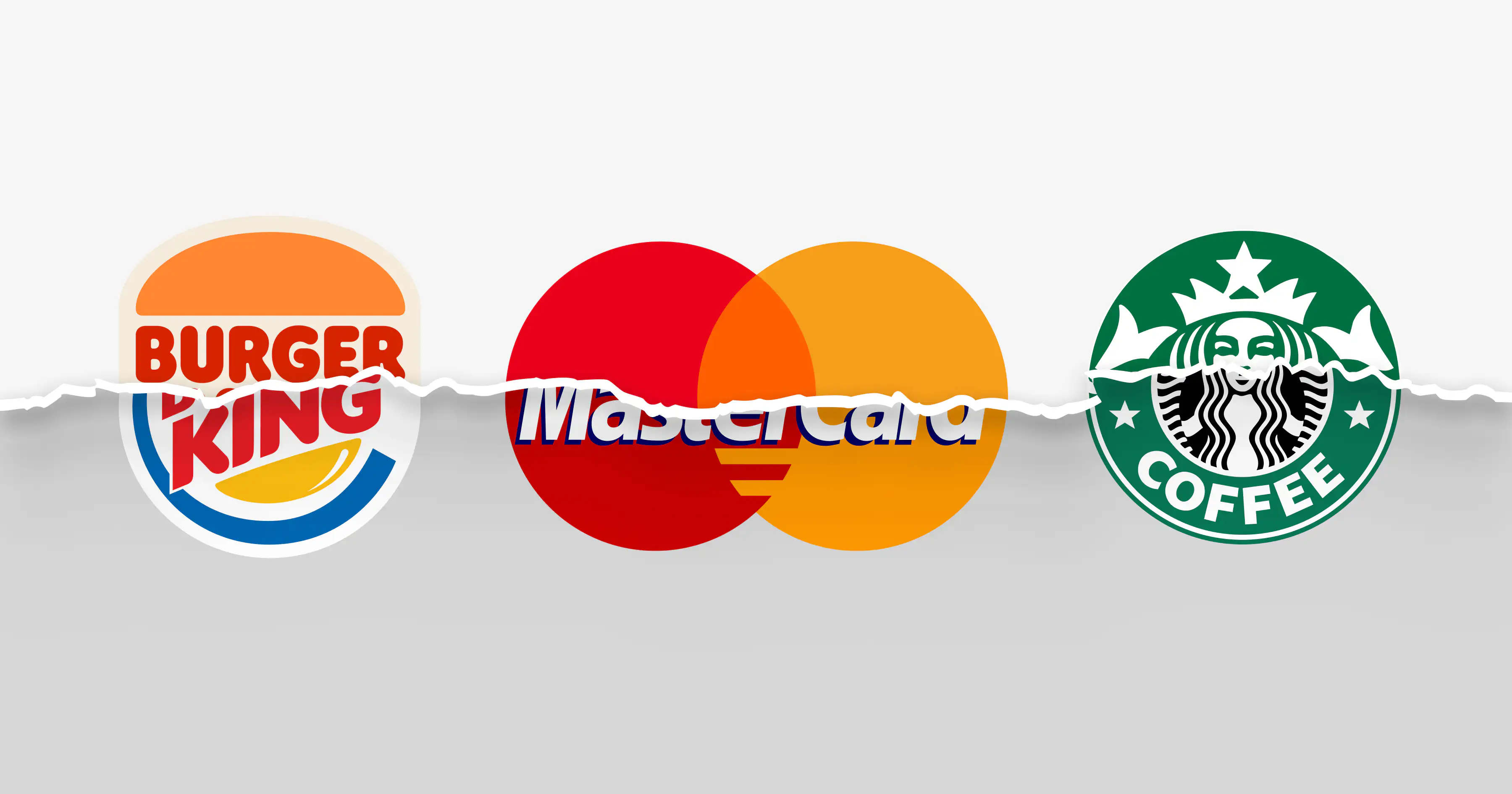
Mastercard's recent evolution illustrates this quiet effectiveness. The company dropped its name from the logo in 2019, relying entirely on the overlapping red and yellow circles. For existing cardholders, this barely registered since they'd been seeing that symbol for decades. But in digital contexts, payment apps, and global markets where English isn't dominant, the wordless mark functioned better. The rebrand removed friction in emerging channels without disrupting established recognition. Most people would struggle to tell you when the change happened. But Mastercard's brand recognition in digital payments improved measurably.
The best rebrands simplify recognition, especially in places where language can’t carry the message.
That's the paradox of successful rebranding. It often feels like less of a transformation than anticipated. No dramatic shift in public perception. No viral moment. Just gradual improvement in the metrics that matter: conversion rates, sales cycle length, customer understanding, and competitive differentiation.
Progress is when the audience doesn’t need to ask, “So what do you do?”
Frequently Asked Questions about Rebranding
What is rebranding?
Rebranding is the process of strategically redefining how a company presents itself to the world. It goes beyond visual changes to include positioning, messaging, identity, and brand narrative so that external perception aligns with the company’s current reality and direction.
Is rebranding the same as a brand refresh?
No. A brand refresh updates existing brand elements such as colors, typography, or layouts while retaining the core positioning. Rebranding addresses deeper misalignment and may involve changes to the brand’s purpose, positioning, name, messaging, or identity system.
When should a company consider rebranding?
A company should consider rebranding when it has outgrown its original positioning, entered new markets, shifted its business model, merged with another entity, or when customers consistently misunderstand what the brand stands for.
How often should a brand be rebranded?
There is no fixed timeline. Most successful brands rebrand only when there is a meaningful business or market shift. Rebranding too frequently can create confusion and dilute trust, while avoiding it for too long can make the brand feel outdated or irrelevant.
Does rebranding mean changing the company name?
Not necessarily. While some rebrands involve a name change, many focus on refining positioning, messaging, and visual identity without altering the name. The decision depends on how closely the name aligns with the company’s current and future direction.
What are the risks of rebranding?
The biggest risks include losing brand recognition, confusing existing customers, or launching a visual change without strategic clarity. Rebranding without a clear business rationale often leads to superficial results that fail to create long-term impact.
How long does a rebranding process take?
A strategic rebranding process typically takes several months. This includes research, stakeholder alignment, positioning development, identity design, and rollout planning. Rushing the process often leads to misalignment and short-lived results.
How can you tell if a rebrand has been successful?
A successful rebrand improves clarity and consistency across touchpoints. It often results in better customer understanding, stronger differentiation, improved conversion metrics, and internal alignment around what the brand stands for.
Will rebranding affect existing customers?
When done thoughtfully, rebranding should strengthen relationships with existing customers rather than disrupt them. The goal is to evolve the brand while preserving what loyal audiences already trust and value.
